Best and Worst eCommerce Checkout Practices
No matter how many times you've tested your eCommerce checkout it could still be better. We spend so much time trying to get people to fill up those online carts only to lose them in the checkout. Here's a few of the hits and misses I've noticed this quarter in online shopping carts:
The Bad
You Can't Handle Phone Extensions or ZIP+4
You tried to reduce the number of incorrect phone numbers you received by validating the number of digits but that also stopped customers with work phone extensions from putting them in. Not only are you causing the form to fail when the customer is trying to checkout but you're making it harder for your customer service staff. Now your staff is going to have to wade through menus or an operator to contact the customer directly.
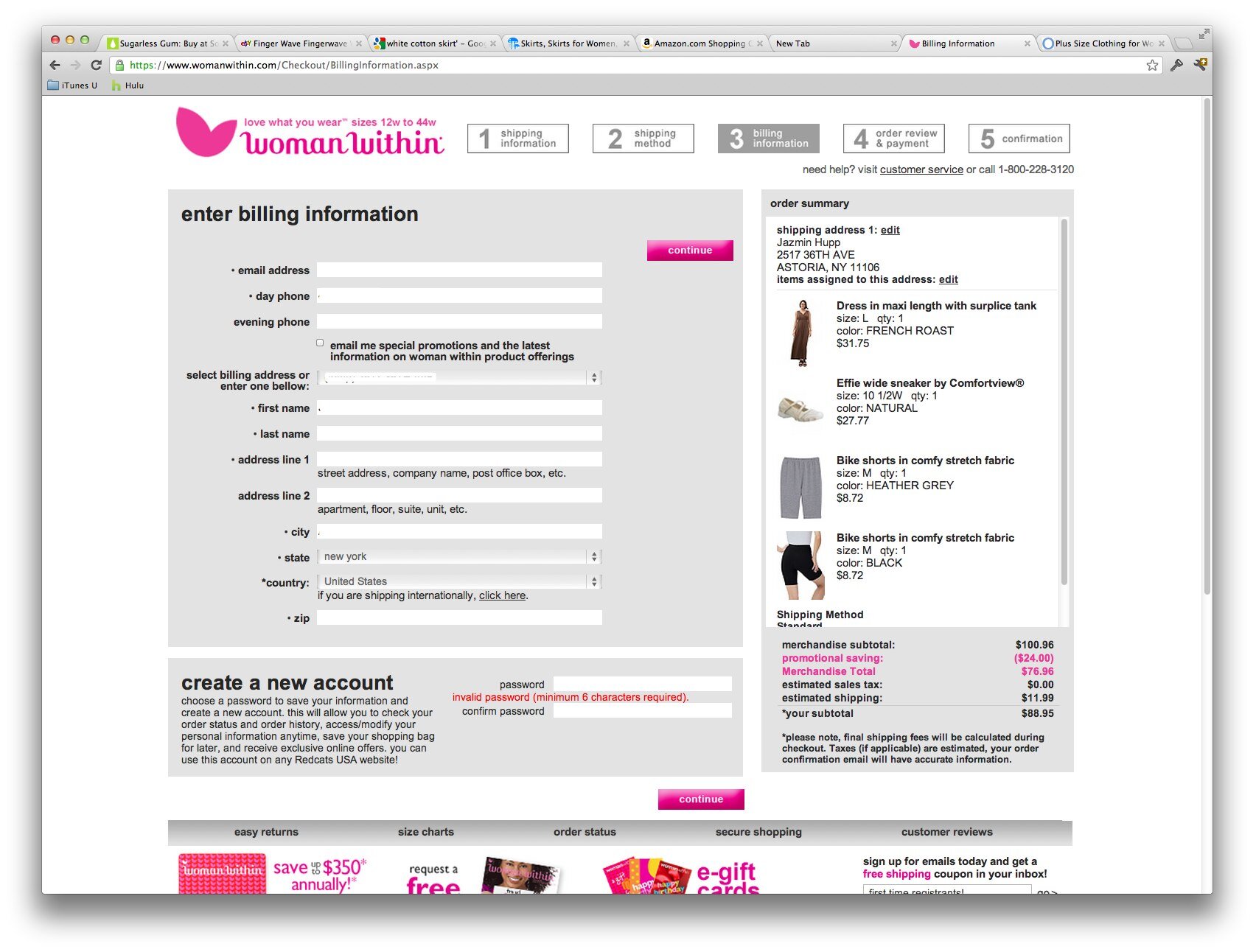
WomenWithin had the worst ZIP code +4 handling. It returns a "your order cannot be processed due to technical errors" instead of a clear explanation of the zip code problem. I contacted their customer support about this issue and got blown off by an auto-responder apologizing for the problems I was having with their eCommerce checkout. (Too bad most of their customers give up their carts and they don't have methods to handle real technical feedback.)
Your Forms Don't Handle Auto-filling Correctly
Your customers are becoming more and more dependent on auto-fill features in the popular browsers and plugins. Test your checkout forms with:
Chrome, Safari, and Internet Explorer browser autofills on desktop and mobile
The Good
Discounted Upsell In Your Checkout
This can decrease your conversion rate when customers get distracted by a last minute upsell, however it may be worth the risk if basket size is more important. I prefer putting the upsell on the checkout confirmation page (after the order was placed) and offer free shipping on any added items.
Paying $200 a Month To Really Find Out How Your Customers Found You
Follow all the conversion funnels you want but you're still guessing precisely how your customers found you. Luna Bazaar gives away a $200 store credit once a month to customers who optionally answer two questions during checkout. The questions are:
How did you find out about Luna Bazaar? (Be specific, for example "searched for paper fan in Google" or "Brides Magazine"
What additional products would you like to see in our store?
Lower Credit Card Costs By Doing (a little) Good
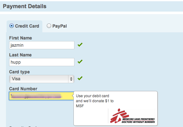
Debit cards are typically several percentage points cheaper than credit cards to process. Hotels.com encourages customers to use debit cards by offering to donate $1 to Doctors Without Borders. They are saving more than they donate on most transactions while additionally appearing like they care. Saving Monday + Social Proof = Double Win.
Reorder Reminders
You should already be familiar with Amazon's Subscribe and Save feature, but if that doesn't fit for your store, check out what Uline does. Just a simple checkbox at the bottom of your checkout page, asking if you'd like a reorder reminder at some point in the future. This is a no brainer for supplies.
Adding Social Proof to Your Checkout
Ok you've got your Truste seals and BBB logo in your checkout already right? J&R goes one step further by displaying positive reviews right next to that checkout button.
Add Strong Method to Contact You On "No Result" Product Searches
On focused eCommerce sites, you should encourage shoppers to contact you for items you don't have results for. Arlington Wine turns any failed search into a partially filled out contact form for the search term. Large e-commerce and diverse sites may not be able to handle the volume of contact this generates but for a small store, this is excellent. By asking additional information about the item wanted, the message is more likely to be relevant to a product and they are more likely to be able to provide a price accurately.


