Where To Start Optimization Testing On Your Website
If you're just getting started with web optimization testing or have limited testing resources (hey that's like everybody), which pages you test is the most critical decision you have to make.
If you're just getting started with web optimization testing or have limited testing resources (hey that's like everybody), which pages you test is the most critical decision you have to make. At today's WhichTestWon's Conference I learned from Justin Rondeau that our optimization instincts are probably wrong on where to start testing.
Page Requirements for Optimization Testing
Before you can test a page, it must meet these two requirements:
Does the page get enough traffic to reach statistical significance in a reasonable time frame (1-5 weeks)?
Does the Page Directly Impact Conversation? If Yes, what is the current conversion rate? If No, what is the long term value of the conversion that this page lifts?
Start Lower in Your Funnel
For an eCommerce site, start as late in your conversion funnel as possible. Here's a typical eCommerce funnel:
Entry Pages: These are politically charged since many people may be involved in creating these campaigns, skip optimizing these first.
Category Pages
Search Results
Product Pages
Cart & Checkout: START HERE. Few people will challenge you to improve the cart because carts are just carts. You can create a lot of lift here.
Receipt/Thank You: Rarely tested! Try an up-sell or cross-sell here instead of during checkout.
Next, Where Is Your Landing Money?
Don't start with high bounce rate pages. We know–they're sinking ships that you'd like to save. Not worth your time. Try landing pages for your highest conversion traffic. Or landing pages for your most expensive (PPC) traffic.
Next, Test Your Conversion Path
Now that you've improved the beginning and end of the funnel, now you can test the middle. This means testing your category pages, search result pages, product pages, and so on. Find everything that is stopping people from buying in your funnel and test how to fix it.
Next, PPC Traffic
If you're paying for customers to click on your links, you need to nail the landing page. At a minimum, your page needs to feature what your ad claimed. You'll be surprised at how many people screw this up.
Next, Referral Traffic
Know who is sending you traffic and where they are sending them. Make sure you're meeting the standards that people expect.
Am I Done Yet?
Of course not! Follow WhichTestWon for more testing ideas or get you butt to Austin for the Live Event.
Get Free Press For Your Startup With Original Data
Getting traditional PR coverage is hard! As new startups flood journalists with lame press releases, how do you stand out from the pack? Will Flaherty of SeatGeek taught "Data Driven PR" at General Assembly today.
Startups have a treasure trove of valuable, propriety data regarding some aspect of their given vertical. When packaged in a digestible and usable format to the right journalists, it will get you mentioned. Although it may not be a love story about your company, it will get you more free press.
What kind of data do you have?
Demographics about your audience
Trends in your marketplace
What Your Data Can Lead To
Print: Stories were created from data sent to individual writers.
Radio
TV: Since television is a visual medium, they place the highest value on giving them someone who is immediately available to be on camera. This means you need someone who can talk knowledgeably and is willing to meet a camera crew wherever local news crews are.
Infographics: These are produced by SeatGeek and take about 15-20 hours to produce. You'll notice in their Final Four infographic that they partnered with Seamless to get even more interesting data.
How to Pitch Data
Create a couple of hypotheses around a topic that your audience might find newsworthy. SeatGeek picks a type of event and location to focus their analysis on based on which news outlets they want to attract. It's faster to chase existing stories in news (like the Super Bowl) and provide data to earn mentions. SeatGeek has also done well digging up deep data on an original story to get higher quality mentions.
Pull the raw numbers into something like Excel and analyze it while keeping an open mind for new findings.
Synthesize the trends you're seeing in the data. What are the changes over time, locations, etc. Write compelling punch bullet points.
Create a visual element (graph/infographic) to convey your data in a different and powerful way. (Don't forget to include your logo & URL on the graphic)
Push the pitch out to interested journalists, bloggers, and media members.
Building Your List of Media Members To Pitch
Find the media members who are writing stories in your locale/vertical/etc. If you know one site that perfectly epitomizes the readership you're looking for, copy their URL. Then do a Google search for "related:URL.com" to see the sites that are similar to them.
Most of the time, their email address will be listed on their stories or website. If not you can use a few tricks to find it.
If they work for an organization with a common email structure like first.last@company.com you can use that. You can use Gmail tools like Rapportive to confirm your guess.
You can search the journalist's tweets for their email address using sites like Snap Bird. Just enter the target's Twitter name and the search term "email".
How to Contextualize Your Data Points
Comparison: How do prices/demand/profits compare to others or past? How do customers in your area compare to other areas?
Superlatives: Most expensive/popular thing in X years.
Trends: How is prices/profits/demand changing over time.
If Statements: If you bought all components individually would it be cheaper than buying them individually? If you had bought this widget it the past, what would it be worth now?
Use Google Alerts to track what are popular story topics in your industry.
Writing Your Pitch
Punchy, description subject line. Use an actual data point that will stand out to a journalist drowning in story pitches.
Personalized opening paragraph. Make it clear this isn't a stock email to hundreds of people. Mention your specific relationship with them whenever possible.
Crisp, clear data points. Write in complete sentences (that the journalist can copy) and bold the numbers you're pitching.
Always provide a link. Encourage the journalist to link to your site by providing a landing page that supports the story (hopefully a page that puts readers a click away from a transaction with you).
Give them a method to follow up. Make yourself available to provide more data or provide a quote. Will uses a Google voice number that forwards to his cell phone (which I thought would be great for scaling later on, if you want to have different folks answer at different times).
Check It Out
OkCupid (a dating site) pulled aggregated data on their users to create buzz-worthy blog posts and earn press mentions in the New York Times.
Yipit (a daily deal aggregator) has become the go-to source on daily deal industry metrics. They produce detailed data reports that they sell to the other daily deal sites and the financial community.
7 Reasons You Should Focus on Women in Your Advertising & Your Business
Gallop's keynote is required watching for men & women – she teaches us how businesses are missing out on innovative ideas & profits by staying male-centric.
Cindy Gallop opened the second 3% Conference in San Francisco, named because only 3% of Creative Directors in advertising are women. Gallop's keynote is required watching for men and women, as she teaches us how businesses are missing out on innovative ideas and ultimately profits by staying male-centric.
Key Takeaways
Women ARE your target audience. Women are no longer a "niche" marketing target. They make the majority of purchases in almost every sector and are key purchasing influencers in every sector (even traditionally male-dominated ones). Women influence 60% of car purchases and 90% of technology purchases. Women are even the majority of gamers today, if you include social gaming.
"Women share the sh*t out of everything." At any social gathering listen to the men talk about sports scores while the women share their experiences. Women have shared their experiences to build intimacy since the world began so it's no mystery why today they are the majority of social media users.
Women get stuff done. Even if your product is aimed at men, Ms. Gallop recommends targeting your advertising at women. Women are the norm. Men are now the niche audience. There is a ton of money to be made by taking women seriously.
Marketing done with women through the male perspective is no longer acceptable. When the 97% of Creative Directors are men, you gets ads that don't feature women in dynamic, engaging, and aspirational roles – instead you only see women as mothers, girlfriends, and sidekicks. We need a new approach to creativity – created by women, presented to female Creative Directors, for female clients.
"Women challenge the status quo because we are never it." Women innovate and women disrupt. If you want your company to be innovative, find every department run by an all-white-male team and add women to it.
"Women notice things that men don't." They notice relationships. They notice how people communicate. They notice how to get people to work together more cooperatively naturally and intuitively. Women notice the things that will make your company run better than it does today.
"Women get sh*t done." How many women do you know that support men by doing the things they don't want to do? From the laundry to Sheryl Sandberg operating Facebook so Mark Zuckerberg can do what he really wants to do. The men who recognize this can still be the stars of the show but have a much smoother operation behind the scenes.
Your To Do List
Cindy Gallop implores men and women to do the following things to help change this culture, and ultimately make a ton of money.
Call It Out. If nobody says anything, nothing will change. Every time you see a conference with an all-male line-up – say something. Every time the junior male account rep tries to take over a meeting you should be running – say something. It doesn't require being angry, it just requires pointing it out, because gender bias is often unconscious. You have to "break the closed loop of white guys talking to other white guys about white guys."
Put Yourself Forward. Women who don't promote themselves help this male-dominated cycle continue. Gallop cites how there's been a ton of outrage over Twitter's lack of female board members but women she knows (and are highly qualified) hesitate even nominating themselves to advise a new startup.
Redesign the Business. Business has been built for centuries around a male model of command and control, which is perfectly logical because, for centuries, women weren't allowed to work. The Future of Business is about complementing that with female values – collaboration, consensus building, and community. The system of business today is based around men going to work and women staying at home to support them. The reason we don't have enough women in leadership is because the very system is built to work for men and not the women who shoulder an unfair amount of the home support work. When women look up at the men running their organizations and see the grueling hours, they opt-out. But why have we designed every position at the top to be so unbearable? It doesn't have to be. Gallop challenges us to redesign a bite-size chunk of how something is done at your company. Redesign it the way you want to work and point to it as an example of how a redesigned business process makes work better for everyone.
Gallop believes the business model of the future is "shared values + shared action = shared profit (financial & social)". This is the business model she urges brands to adopt. Go beyond "co-creation" and pursue "co-action" between brands and people to benefit everyone. This business model also applies to men and women working together to create a world that we will all love working and living in.
Watch It!
Prioritizing Product Features for Cannabis Companies
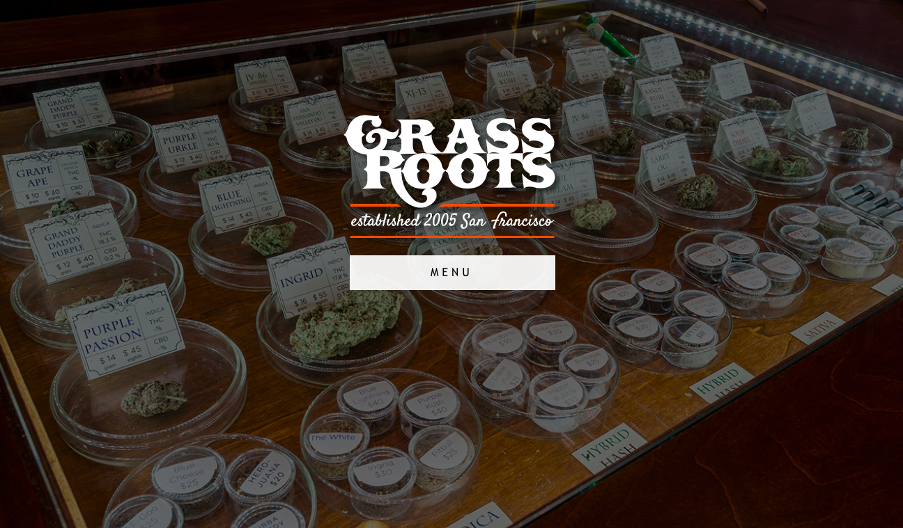
Whether you're starting a MMJ dispensary or edibles brand: cannabis product feature strategy will be vital to your success.
Maybe you're designing the next Vape sensation or the next killer weed app. Whether you're starting a MMJ dispensary or working on your next edibles brand, product feature strategy will be vital to your success. (If you're opening a marijuana retailer, just replace the word "product" with "store" features.) You can always add more features but which ones matter most to your customers and which can you execute?
Picking Your Target Audience
Everyone wants to sell their products to everyone. But the truth is, you need to narrow down on who your most profitable customers will be. Even though lots of different types of people shop at Trader Joe's, the company makes many decisions by targeting a specific customer: “An unemployed college professor who drives a very, very, very used Volvo." You'd have no idea that their clear target customer is what helps make the South Pacific theme with matching specialty food at low prices so cohesive (and profitable).A clear target audience will allow you to make core strategy calls like:
- Product Line Decisions - "What products do my customer need?"
- Product Feature Decisions - "What does my target customer want most?"
- Location Decisions - "Where does my target customer shop?"
- Pricing Decisions - "How much does my target customer have to spend?"
- Advertising Decisions - "What would influence my target customer to try my brand?"
If you keep a target customer group in mind when making strategic decisions, the end result will be a cohesive product that has the potential to sell.
Picking Product Features
Let's say I'm designing a bud vaporizer targeted at glaucoma patients over 50. You can brainstorm a hundred features that you could add to this vaporizer but how do you choose which ones you should focus on? You have competitors that are developing new vaporizers with larger staffs than you, so you better move fast to keep up. Luckily you only have too weight two factors:
- What features will differentiate my product from the competition? (In a way that won't be instantly copied.) AND
- What features will my customers PAY for? (Extra features are nice but if it won't lead to more sales, skip it.)
Number two is a little deceiving. This includes features you can and can not advertise. Features that your customers love and tell their friends about ("looks like a USB stick so it's easy to get passed airport security") are just as important as features you can put in a big headline ("lightest vape on the market").
Prioritizing Product Features By Execution
Business success thought-leader John Spence, boils his Wharton School of Business class into one sentence:Successful Strategy = Valued Differentiation x Effective ExecutionIf you're chosen product features that differentiate you, then the most important factor to your success is which features can you effectively execute? In his book, Letters to a CEO, John Spence breaks this down:
- Highly differentiated but not valued by your target customer = bankruptcy
- Highly valued but easy to copy = price war (and there is always someone willing to drop their prices and go into bankruptcy faster than you)
- Highly valued and defensibly differentiated but not executable = bankruptcy
- Highly valued, defensibly differentiated, well executed = business success
If you can pick the features that you can effectively deliver to an audience primed for your product, your cannabis brand will be in great shape. Making the plans is often a lot easier than actually executing on them. John reminds us that "Great creative ideas abound; flawless execution of those ideas is exceedingly rare."
2014's Hot Homepage Design Trend: Mega Images
You know those giant brand images filling up new home pages? Looks great but does it work?
Justin Rondeau examines tests from over a thousand brands every year, as Chief Editing & Testing Evangelist for WhichTestWon. Justin explained the Mega Image trend he's seeing across the industry and some tips on doing better testing at WhichTestWon's Live Event in Austin today.
Do Mega Image Homepages Work?
You know those giant brand images filling up new home pages? Looks great but does it work? Justin presented a case study from KinderCare, which had been fine tuning their home page for years but was looking for a big lift. After the redesign with a Mega Image, they experienced a 17% lift in conversion. That's a huge lift for an established homepage but the resources required to pull this off are also huge. Unlike changing the color of a button, you've got to coordinate fresh creative that blows your brand out of the water.
Mega Image Tips
- Make sure your photo scales with the browser window size.
- DON'T use stock photos: make it genuine, make it your brand! At one company we spend about $30K a year shooting photography of our employees and our customers. (If you're looking for a team to do the same for your business, I use Meier Brand's creative team.)
- If you're using faces, try to make sure the person in your photo is looking where you want the visitor to look. Faces grab a lot of attention and will be the first place your visitors look. If they compete with your main message you probably won't see a lift.
- Don't implement blindly, make sure to test this. Although there are lots of instances of this working for other brands, your experience may be different.
Mega Image Homepage Designs With Movement
I don't have testing data on these, but was intrigued but two Mega Image homepages that use movement to complement the design. Click through the images so see one very common and one not-so-common movement implementations.
How To Start Testing
Many marketers say they don't have the resources to start testing but tools like Optimizely make testing easier than ever. Here's a few tips on getting started.
- Education is #1: The tools are great, but it doesn't replace a sound education in testing fundamentals. I personally recommend WhichTestWon's Live Events to start. You can also download their report on testing trends.
- Hire a Proper Team: Optimization requires people. If you have no one, push for a part-time resources. If you have part-time resources, push for full-time, and so on.
- Push for an Ideological Shift: If your organization doesn't believe in a data-driven testing, you're going to have to push for that from the top down. That means constantly communicating how your testing, the learnings and your results (good and bad). Showing the improvements you're making constantly will build trust in testing.
- Stay Curious - Question Everything: If there is one thing to look for in your testing culture, it's insane curiosity. Do you question everything? Great! You're doing to go well here.
Stop Sporadic Testing
Many organizations are testing as they like without a methodology.
Why It Doesn't Work
- No Long Term Gains: You may be small lifts but you won't be able to scale that effect.
- No Test Learnings: Just because changing a button color created a conversion lift, doesn't mean you know why. If you can't figure out why, you can't apply that learning going forward.
- Higher % Failure Rate: Your tests are much less likely to be correctly formulated if you don't do this very often.
Why We Don't Test More
The majority of organizations only have one person dedicating half their time to testing. It's your job as an optimizer to build the case for more testing resources with a proven track record of successful lifts. If you're not reporting back on your successes and continually proving your contribution on the bottom line, start now!
Your Company's Facebook Posts Will Soon Be A Waste Of Time
The day when your Facebook organic posts will reach virtually no one is coming fast.
Without boosting your Facebook boosts with advertising spend, you're shouting into the dark. No matter how hard you worked to build your fan base, as many as 98% of your fans never return to your Facebook page after liking it.
Facebook Organic Post Reach Is Diving Off A Cliff
The percentage of your fans that you reach organically (without paying for ads) is rapidly declining: from an average of 12% in October 2013 to 6.2% in February of 2014 (according to social@Ogilvy). The day when your organic posts will reach virtually no one is coming fast.
Shift Strategies or Abandon Facebook Organic Posts in 2014?
Even though Facebook has become an advertising network (with a social media network as a lost leader), you can still target extremely specific audiences. What other medium can you find 15-17 year old girls who live within 50 miles of Cleveland, Ohio, and own an iPhone 4 or iPhone 5? If you have the ability to craft campaigns that speak to your customers in their own homes and phones you can reap enormous rewards. I can't name another newspaper that is sent directly to all of my customers, for as little as $25 a campaign. Can you?
Custom Audiences Are Your New Best Friends
You're going to upload lists of email addresses and lists of phone numbers from your customer contact lists. This will allow you to target your current customers for ads (even if the haven't liked your page) and find more people like your customers on Facebook. Custom Audiences will allow you target people who have shopped with you before.Uploading your customer's email addresses and phone numbers to Facebook puts a lot of trust in their court. Facebook says that they encrypt the data that is uploaded, use it for matching purposes at that time only, and then delete the data. This means you should update the data periodically to add new customers. Privacy is never perfect but this is likely worth the risk for your brand. (Technically, they hash the data, not encrypt it, if you want the full technical explanation.)If uploading your customer lists are too creepy, try tracking everyone who visits your homepage. You'll install a tracking code in your header tags so that you can retarget ads to anyone who visits your company's website. Slightly less creepy and it continues to grow as your website traffic grows.
Lookalike Audiences Are Your New Holy Grail
How often do we sit around as marketers and complain: "I wish I could find more people who are just like my best customers." Facebook is offering to deliver them to you. Once you've uploaded a list of your best customers, you can tell Facebook to match their entire database of people within any single country to your type of people. To get started, see Facebook's "How to Create Lookalike Audiences".
So Now Facebook Is Just Like Any Other Advertising Network? Nope!
It seems clear that Facebook is turning into an Ad network and should be treated like the New York Times or Google Adwords. But one thing still separates Facebook, according to the Ogilvy report. There's one thing that STILL means your social media marketing messages should be fundamental different from other paid ads.
Best and Worst eCommerce Checkout Practices
No matter how many times you've tested your eCommerce checkout it could still be better. We spend so much time trying to get people to fill up those online carts only to lose them in the checkout. Here's a few of the hits and misses I've noticed this quarter in online shopping carts.
No matter how many times you've tested your eCommerce checkout it could still be better. We spend so much time trying to get people to fill up those online carts only to lose them in the checkout. Here's a few of the hits and misses I've noticed this quarter in online shopping carts:
The Bad
You Can't Handle Phone Extensions or ZIP+4
You tried to reduce the number of incorrect phone numbers you received by validating the number of digits but that also stopped customers with work phone extensions from putting them in. Not only are you causing the form to fail when the customer is trying to checkout but you're making it harder for your customer service staff. Now your staff is going to have to wade through menus or an operator to contact the customer directly.
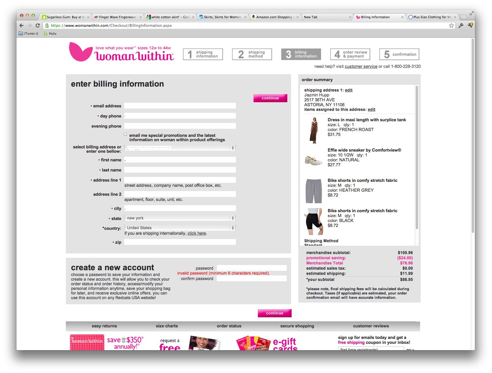
WomenWithin had the worst ZIP code +4 handling. It returns a "your order cannot be processed due to technical errors" instead of a clear explanation of the zip code problem. I contacted their customer support about this issue and got blown off by an auto-responder apologizing for the problems I was having with their eCommerce checkout. (Too bad most of their customers give up their carts and they don't have methods to handle real technical feedback.)
Your Forms Don't Handle Auto-filling Correctly
Your customers are becoming more and more dependent on auto-fill features in the popular browsers and plugins. Test your checkout forms with:
Chrome, Safari, and Internet Explorer browser autofills on desktop and mobile
The Good
Discounted Upsell In Your Checkout
This can decrease your conversion rate when customers get distracted by a last minute upsell, however it may be worth the risk if basket size is more important. I prefer putting the upsell on the checkout confirmation page (after the order was placed) and offer free shipping on any added items.
Paying $200 a Month To Really Find Out How Your Customers Found You
Follow all the conversion funnels you want but you're still guessing precisely how your customers found you. Luna Bazaar gives away a $200 store credit once a month to customers who optionally answer two questions during checkout. The questions are:
How did you find out about Luna Bazaar? (Be specific, for example "searched for paper fan in Google" or "Brides Magazine"
What additional products would you like to see in our store?
Lower Credit Card Costs By Doing (a little) Good
Debit cards are typically several percentage points cheaper than credit cards to process. Hotels.com encourages customers to use debit cards by offering to donate $1 to Doctors Without Borders. They are saving more than they donate on most transactions while additionally appearing like they care. Saving Monday + Social Proof = Double Win.
Reorder Reminders
You should already be familiar with Amazon's Subscribe and Save feature, but if that doesn't fit for your store, check out what Uline does. Just a simple checkbox at the bottom of your checkout page, asking if you'd like a reorder reminder at some point in the future. This is a no brainer for supplies.
Adding Social Proof to Your Checkout
Ok you've got your Truste seals and BBB logo in your checkout already right? J&R goes one step further by displaying positive reviews right next to that checkout button.
Add Strong Method to Contact You On "No Result" Product Searches
On focused eCommerce sites, you should encourage shoppers to contact you for items you don't have results for. Arlington Wine turns any failed search into a partially filled out contact form for the search term. Large e-commerce and diverse sites may not be able to handle the volume of contact this generates but for a small store, this is excellent. By asking additional information about the item wanted, the message is more likely to be relevant to a product and they are more likely to be able to provide a price accurately.
14 Keys to Great Retail Merchandising
Today, I learned how boring all my store display ideas are from Bob Phibbs, "the Retail Doctor", at the Apple Specialist Conference in Austin.
Why Merchandise?
It raises your average purchase amount by silently adding-on to every sale.
Turns mission shoppers into browsers and makes them curious about what else you offer.
Great Merchandising...
Is simple and fast to understand.
Slows down a customer's eyes
Is coherent and logical (you don't put diapers next to vodka)
It groups products that a certain type of customers are likely going to buy (you put products for seniors in one display, not mixed with products for parents and teenagers)
What is the message you want to send?
We have this in five colors?
We have sales stuff?
Here's the full picture of what you need.
4 Types of Bad Displays
Illogical groupings of products that don't work together.
Crammed displays with too many choices.
Half empty displays where the fixture stands out more than the product.
Add more signs (if the first signs didn't work, add more).
6 Types of Good Displays
Complimentary displays: paper towels with window cleaner or waffles with pancake syrup.
Coordinated displays: all the things you need to do "X" (all the accessories you need to paint a room).
Environmental/lifestyle displays: Shows the products in use or reasons to buy the product visually. Garden bug spray with big panels on what type of damage bugs do and how to use the spray.
One product type displays: Can be strong but are often dangerous. All the belts hung together are great if you're looking for a belt but you're going to skip it if you didn't intend to buy a belt.
Stand out displays: Intrigue the mind by putting something unexpected. Hang 30 light bulbs and turn one on.
Stop displays: Displays that make you stop to figure it out but don't have anything to do with the product you're selling.
How to Do Great Merchandising
Start at the Front Door: Make a front window display that makes it clear there is something new (or arrange the old product in a way that makes it look different).
Plan Inventory: Make sure you have inventory to support the sales of whatever you feature.
Find one Thing to Unify: A theme or purpose that everything works together on.
Build the Biggest Add-on: Accessorize a complete outfit.
Pay Attention to Color: Add more color or coordinate colors if possible.
Vary Heights: Put products at multiple levels. Products on counters encourage customers to touch them. Customers are more likely to buy anything they touch. Products on walls have less engagement.
Consider Something Different: A "pig in the window" is something that engages a customer with color, movement, or oddity. Put a moving train in your window and people will watch it. Put a toilet in your window to sell waterproof iPhone cases. Generic signs kill good displays. If the copy doesn't provoke a reaction, you've failed.
Lighting: Focus on what you want to sell the most. Show the customer where to look.
Proper Signage Helps Educate Your Customer: Make the customer feel smart. Anytime a customer has a question or feels intimidated they won't buy.
Sell the System: Put all the accessories you need together. All the ingredients for a recipe put together.
Keep It Sparkling: Clean all the your displays daily. Clean your front doors hourly.
Monitor Sales: Decode whether placement or product drove sales. Move a display every two weeks to different parts of the store and monitor the sales in different locations. You'll find you have hot spots and cold spots on the floor for placement.
Clear Pricing: Don't make anyone guess what your products cost.
Brand Your Signage: Young customers are likely to take pictures of fun displays, make sure your branding shows up with it.
4 Unique Retail Signage Examples to Increase Sales
Stair Signage Attracts And Informs
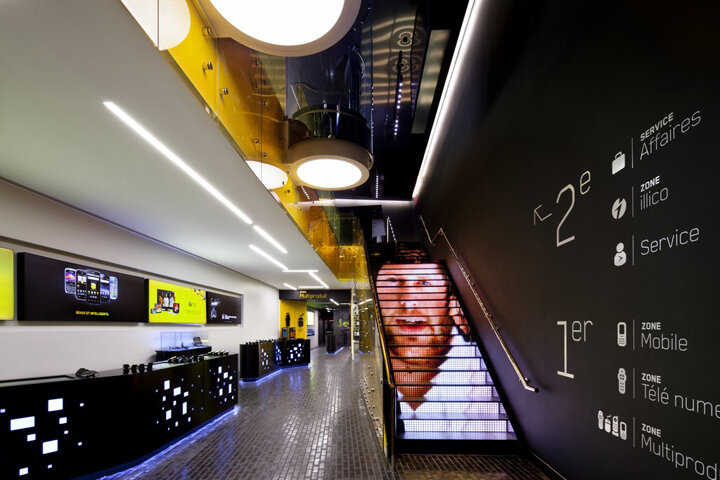
Unimax Tattoo Supply on crowded Canal Street in NYC, uses stair signage to attract people to walk up to their second story location. Once customers are walking up, the signs inform you of all the different items you can expect inside. Since most of their merchandise is hidden behind counters, seeing a category of items you'd like to buy on the stairs encourages you to ask a staff member to show them to you.If you have the big bucks, get an animated stair case. Videotron in Montreal claims to have installed the first one in North America at their flagship store.
Digital Signage That is as Functional as it is Beautiful
When Microsoft opened a store across the hallway from Apple in the Mall of America, I wondered how they would counter Apple's award winning store designs. A wrap-around digital wall slightly above eye-level allows promotions to flow effortlessly across the entire store. But the gorgeous displays aren't even the best part. The Xboxes throughout the store activate a window in the displays that allows you to play on the big screens. The prominence of the xBox displays encourages other customers to investigate.
Tell Your Customers How Much Your Values Are Theirs And How To Uphold Them
Part confirmation and part guilt-trip this table top signage from ultra-popular Pine State Biscuits in Portland, Oregon does it all. By phrasing all their information as a thank you to their customers they increase compliance without nasty "bus your own table, your Mom doesn't work here" type signage. They open the card by affirming their customer base for shopping local, which increases loyalty to their brand. Following up the affirmation are the house-keeping reminders for this busy counter-service restaurant. Although I'd recommend a more comprehensive customer feedback program, putting your email address out their is a great start.
Unique Coffee Cup Stickers Increase Revenue for Coffee Stand
I thought I'd seen every way to advertise on a coffee cup until Cowgirl Coffee in Whitefish, Montana served me an ad on my straw. Typically placed on the lid of hot drinks to keep liquid sealed in while you're driving, this ad placement is ultra-local and very noticeable. According to their website, they feature an advertiser for 2-3 weeks exclusively, serving about 4,500 customers. Stickers have included coupons, events, and classic branding ads. I'm just glad this women-owned business hasn't had to stoop to the lows of the competitive northwest coffee stand scene. Bikini and lingerie wearing baristas compete for your dollar at chains like Baristas Gone Wild and Lace n' Lattes throughout the northwest.
6 Ways You Haven't Used Social Media To Improve Your Blog
No matter how long you've been doing social media for, there are new tricks and tips coming out every day. Tip #1 and #5 were well worth the price of admission for my organization. Here are my notes from Austin Gunter's (Brand Ambassador, WPEngine) presentation on "Developing Digital Marketing (Social Media) In Your WordPress" at WordPress Camp NYC.1. No One Cares About What You Just Said On TwitterThink about your site from the perspective of a first-time visitor, they're looking for a reason to trust you. Stop using the standard Twitter widget to show the last few tweets you've sent (which could be awesome or random rants). Instead reconfigure your Twitter widget to display your account's favorites. Favorite great tweets about your organization and re-label your widget something like "140 Character Testimonials".2. It's Time To Make Sharing Your Content AwesomeUsing the standard Facebook & Twitter share links are LAME. It's time to do some custom development for elegant sharing solutions. Instead of a tiny Pinterest button above every post, Wedding Chicks does an elegant job of encouraging pins. Every image you mouse over has a "Pin It" badge appear in the lower right.3. You Can't Fight On TwitterThere are going to be customer support issues and people are going to complain. You need to take it off Twitter. Generate a support ticket for the customer and email them or reach out another way. 140 characters is not enough to be logical and really help.5. Facebook is for Developing Your Existing Fans, Not First-Time CustomersYour customers aren't going to follow you on Facebook until they've already experienced your brand. Liking a brand on Facebook is akin to putting that brand's bumper sticker on your car. Use Facebook to develop deeper conversations with your biggest fans, not sell to first time customers. Austin likes integrating Facebook with his blog post comments so the comments on his site spread to Facebook too (and vice-a-versa).5. The One Thing To Use Google+ ForGoogle is now using Google+ profiles to determine who is writing what online for SEO with rel="author". People who have been writing quality content for years will benefit from this move (which fights SEO cheating). To do this, follow these instructions to update your Google+ profile with what sites you write for (or guest post on). This will allow your headshot to appear next to your content on search results (which may increase your click throughs) as well as possibly raise your general rankings.6. Turning Twitter Conversations Into Real StoriesYou can use Storify to collect tweets around a topic or conversation. It allows you to comment and expand on what was said. We've seen great summary posts on conference, news events, and locations.Bonus: Check out Buffer for a super easy way to share what you've read online into scheduled posts that are even faster to use than HootSuite.
Increasing Page Views & User Retention on Your Wordpress Blog in 3 Minutes
Do your readers leave your site right after they finish the first post they came in on? Neil Mody from nRelate gave a great overview of all the elements you need to use to drive more readers to your site and get them to stick around for longer at WordPress Camp NYC today. If you know the basics already, skip to the end for all the plugins your should install in 3 minutes to increase page views.You've Got Nothing Without Great ContentFocus on your message first. Create an original consistent presence on the Internet with quality content first. Then you can build a long-term audience. Everything else optimizes on high quality content. Without good content you won't get far. Your Site Must Load in 3 Seconds or LessYou must use a caching plug-in to speed up the load time of your pages.
- W3 Total Cache (free)
- WP Super Cache (free)
Then you need to use speed loading testing tools to check it.
- YSlow (based on Yahoo Tools)
- Google Page Speed Tools
Hosting Options (from least to most expensive / least to most scalable)
- Blue Host
- Liquid Web
- Media Temple
- WP Engine (specialized hosting that starts at $29/month)
- Rackspace (high-end if you have dedicated staff)
Everything you add to your site will make the site slower. Your site should load in 3 seconds or less. For every extra second your site takes to load you lose a portion of visitors according to Google's analytics.Bring Style to Your Substance With a Quality ThemeHow your site looks can be just as important as your content. Having a stylish theme with clear navigation affects how many users stick around to read more. Just as how a book's cover design affects how many people buy the book in the book store, your theme will affect how many users will read your site.Social Sharing in NOT OptionalYou need to:
- Link to your site on Twitter
- Have an active Facebook page
- Start using Pinterest
You MUST reach out to people in your community and engage! Start commenting on other people's posts. Sending out your content is just half the job, engaging others is your other.Be Where Your Audience Is
- Depending on where your audience is, you need to rank well there. In the US, search traffic is dominated by Google so you must rank well in Google.
- Study your referral traffic and see what terms readers are coming in from. Build content around your most profitable terms.
- Setup Google news alerts for related terms to your content. Build content around trending topics.
- Link parties are collectives of bloggers who are linking to each other to building incoming links. You have to be careful though because your links could end up on less desirable sites.
FINALLY! Engage Your Audience Beyond the One Post They Came in OnnRelate makes plugins for most of these functions but there are tons of great options out there. Tell us which plugins you like in the comments.
- Auto-linking plugins automatically ads a link back to your other content whenever you add certain words to your post.
- Photo galleries and slideshows increase page views (but can be really annoying).
- Related Post plugin should be in your sidebar or at the bottom of your post.
- Most popular post plugin should always be in your sidebar.
- Flyout plugins suggests a related article to your reader when they reach the bottom of the post
- Social sharing and commenting plugins allow your users to easily share your content to their network. One developer said you have to un-gate (not require login) to encourage commenting.
New Trend: Video Holiday Cards - Bergdorf Goodman Goes to the Dogs
I received more video holiday cards than physical cards from businesses this year for the first time. Whether your business is trying to save trees or just preparing for the Postal Service to go out of business, a video holiday card might be right for you.
Tips For Spreading Your Business Message with a Video Card
- Set a budget: Although a video card is cheap to send out through email, you can spend much more producing a video than printing paper cards. Make sure to set a budget and find a video director that can work within it.
- What's the payoff?: The best holiday videos have a plot payoff for watching them. You know how the best commercials can make you want to cry in 30 seconds? Can you make your story pay off at the end? Watch Bergdorf Goodman's longer holiday video for their heartfelt ending. Or check out LivePerson's charity donation at the bottom of this entry.
- Keep it short: 30 seconds to 2 minutes is optimal
- Keep it agnostic: Unless you're sure all your customers celebrate Christmas, it's better to go for general Happy Holidays.
- Make it fun(ny) or unusual: If you want the video to be shared, make it fun or funny. On the unusual side, Tekserve's most successful viral video featured $60,00 worth of recycled iPods.
- The delivery method is the most important part (and often overlooked): Once you have the perfect holiday video card, the most important part is getting it watched. Make sure you consider the timing of sending your video to recipients, the holidays get busy and any non-essential message gets trashed. Can you create a great email message that will make them want to click-through? Will your recipients be able to view it from their mobile phones?
- Seed the sharing: If your holiday message is meant to reach potential customers as well as existing customers, reach out to target blogs and ask them to embed the video. Don't forget to upload it to your Facebook page and YouTube.
Bergdorf Goodman's Holiday Card
Bergdorf Goodman, a luxury department store in Manhattan, created a great holiday promotional video card by letting famous New York dogs lose in the store. Not only are cute pet videos more likely to be shared, but also I would argue that BG's target customers are dog owners. Because having a dog in Manhattan is a luxury, their shoppers are more likely to be pet owners. The fun footage of dogs running through the store gave them a great excuse to show off a lot more products than a typical commercial. Although I would have made the video shorter, the ending is the perfect heartfelt payoff that their target customers will love. If you check the audience analytics on YouTube, you'll see this video is most popular with women age 35-54 (their target customers).
Offering to Donate To Charity
With more businesses limiting gifts to employees, donating to charity on their behalf has become popular. LivePerson sent their customers an email asking them to visit the page screen-shot below and choose from one of twelve charities for a donation. This method aligns your organization with doing good while making your customers feel good. You'll notice LivePerson doesn't mention how much they will be donating so the bottom-line impact was totally up to them.
12 Things You Haven't Tried To Improve Your Website's SEO
"Best practices are things you should have done if you had thought of them first." If all your competitors are doing it already, you won't get the returns you're looking for by jumping in late. Try taking best practices from other industries and reusing them. This quote is from Byrne Hobart, who taught the Advanced SEO course at General Assembly that I attended last week.How to Advance Your Way Up the Blog HierarchyHere's how to work your way from nothing to a top-level blog or news source.
- Do a Google search for "your industry blog" and you'll find the most popular ones. Pick a highly-ranked blog that speaks to your prospects. Then use Google to show sites related to the highly-ranked blog by searching for "related:rankedblog.com." Less popular related blogs will be returned. Continue to do this until you find the least popular blogs with readership communities. Collect these into a list.
- Stalk your new blogger friends. Comment on every post they write on your industry and re-tweet their stuff. After a few weeks they'll start to recognize you as a loyal reader.
- Write a post they'll like on your blog and send it to them. For example, write a deeper-dive into a topic they cover or a clarification of something they wrote. If they repost your piece you're in! Plus you'll be the girl they turn to when they need a quote or clarification on your industry.
- Now use their repost of your content to trade up to more popular blogs. Most bloggers read all the blogs larger than theirs and a few sites less popular than theirs. Write an email to a more popular blog, "You may have seen my post on LesserBlog.com, I liked your related post, and so I write this post."
- Continue trading up until you reach the top blog in your industry.
Get More Shares By Giving Up CommentsYou can get more shares if you make sharing the only action available at the end of your post. When someone gets to the bottom of your post, they typically have a couple of choices: commenting, reading a related article, etc. If you make the only option sharing the article with their network, you'll get more shares. This works especially well with controversial content where your audience wants to add their input but can't because you've removed commenting. Google doesn't discern between people linking to your page because they disagree or agree with you.Fast Content Gets Shared FasterContent that is fast to read will get shared more often and more quickly. Shorter posts rise to the top of Reddit because Reddit takes the velocity of votes into account. So a photo that takes five seconds to read and react to will rise further than a well thought-out post that takes ten minutes to read. So if you have a long article, create an infographic of your top data from the post that you can share everywhere and then link back to your longer article.Get More Shares By Figuring Out Why Your Audience Really ReTweetsWhy do most people actually share your posts? They want to show off that they read your type of content (regardless of whether or not they do). This is why posts by Malcolm Gladwell are tweeted seconds after they're posted. Your audience wants to show off how smart they are for finding your content and sharing it with their friends (Facebook) or potential bosses (LinkedIn).Test Keywords Using AdWords Instead of SEO Because It's Cheaper (Really)Ranking on your keywords through organic search can take weeks and even months to climb to the top. You can buy the top slot through AdWords and check if the keywords you've chosen really convert before investing in a longer-term SEO strategy. Once your keyword terms move into organic search the conversion rate won't necessarily be the same but this is a great tactic to compare potential keywords against each other.Swap SEO Friendly Headlines In After Everything-Else Friendly HeadlinesSEO friendly headlines are stuffed with keywords that target searchers. Everything-else friendly headlines use a teaser proposition, controversial view point, or question to encourage click-throughs and shares. You can post the article with your teaser headline, get a lot of shares, and then switch it to your keyword stuffed headline later. Your article will retain it's popularity for being shared even after you change the headline.How A Print Ad Can Increase Your Search RankRun an ad campaign that tells your audience to search for "your company + what you do" on Google. If you get enough people searching for your brand name in conjunction with high-priority keywords, it will rise your search rankings. You'll be more likely to appear in the search suggestions for what you do. Coupon Cabin ran subway ads asking people to Google their name for coupons instead of listing their URL.Optimize Your Guest Blog BioWe all know that guest blogging (in both directions) will help bring credibility to your site. What you may not have thought of is optimizing the keywords used in your guest blog bio. Try to keyword stuff the link back to your company's site. So instead of "Jane Smith is Founder of Company.com" try "Jane Smith is Founder of the most popular widget company in New Jersey."Links Are ForeverWhen someone posts about your business but doesn't link to you, simply contact them and ask. Articles last just as long as the news cycle but links are forever.Use WordPress if You CanSimply put, search engines love WordPress. To solve the SEO drawbacks of WordPress, download the All in One SEO Pack.Use The Most SEO-Friendly URL For Your BlogYour blog's URL should be YourSite.com/Blog for maximum SEO benefit to your site. If you're in a "serious" business and the term "blog" isn't appropriate for your target audience, use YouSite.com/Articles or YouSite.com/Research.This post also appeared on Women 2.0's Blog For Female Entrepreneurs.
6 Trends in Web Design Coming To A Website Near You
Web design shifts and changes every season just like the fashion world. Instead of watching a runway on Fashion Week, here's a few sites I use to preview what's likely to take off next:
- Behance Network - Creative Professional Platform to share what designers are working on now. Filter results by Blogging, Web Design, or Web Development for a peak. Behance is a NYC-based startup.
- Dribble - A nicely designed portfolio site, check out what's been posted in web design lately. Allows you to search by color if you have one in mind.
- DeviantArt - Less curated than Behance but still relevant, click my link for an overview of popular web interfaces submitted in the last week.
Huge F'ing Background ImagesPopularized into the mainstream by Bing, this has spread to tons of tech startups and newer page designs. Go Right Not DownWhen web designers found out that folks didn't want to scroll down for more than a few page views, they started asking viewers to navigate to the right.Arranging Images In Tag Cloud StyleJust like a word tag cloud makes more frequent words appear larger, some sites are now organizing their images using this principle to make more important images larger. Notification AlertsUsing smart icons with red badges has become prevalent from iPhone Apps to Facebook.
Grey GradientsBlack is too hard to read and white is so 1996, so we've settled on grey gradients as the cool kids color.Better TypographyWe finally got bored with half a dozen font choices and the following companies are driving better typography coming to the world wide web.
Creating Negative-Cost Marketing
Would you rather be the ad next to an article in the New York Times or the topic of the article? Would you rather buy ad spots on TV or be the TV show? These are the questions that Tom Szaky, CEO of TerraCycle, asks business owners to consider. TerraCycle recycles traditional trash into a large variety of consumer products. They make thousands from a self-published book, average 17 articles a day in various publications, and were the focus of a short-lived National Geographic Channel series.Mr. Szaky contends that creating the content, instead of marketing next to other people's content has saved him thousands and had a much larger impact than traditional marketing. My experience a previous supports his theories. I publish an eighty-page pocket guide to using your computer, which costs us fifty cents per piece to print but is more valued by our customers than any other promotional piece we've created. It saves our employees & customers time by being a great reference for common questions while advertising our expertise to the world.In the new age of marketing, trustworthy content will bring you more customers at a lower price than traditional ads ever could.Read TerraCycle's Quest to Create 'Negative-Cost' Marketing on the New York Times website.
Customer Surveying for Apple Specialists
Below is my deck from the Apple Specialist Conference in Miami, Florida. I presented "Two Quick Questions", a seminar on using the Net Promoter Score to:
- Measure customer satisfaction, which directly links to profitability and customer retention
- Measure employee engagement, which directly links to customer engagement and referrals
- Praise employees for good experiences and source testimonials
- Diagnose knowledge and performance gaps
- Listen to the voice of your customer
- Find your "moments of truth"
- Net Promoter Score official website and book
- My article on Best Practices to Responding to Yelp Reviews
- SurveyMonkey
50 Things Your Customers Wish You Knew
No matter what type of business you run, this list by Sonia Simone is required reading. Keep these in mind whether you’re writing web copy or dealing with a customer service issue.A few of my favorites were:
- My life is really stressful. If you can reduce that stress, you become immensely valuable to me.
- Your employees treat me about as well as you treat them.
- Telling me what you don’t know makes me trust you.
- The wealthier I get, the more I like free stuff.
- A lot of the time, I secretly feel like a lost little kid. I don’t admit it, but I want to be taken care of.
- I don’t understand how to use your Web site, but I can’t admit that because it would make me feel dumb.
- I want to buy your product, but I need you to help me justify it to myself.
- I believe that most of what’s wrong in my life is someone else’s fault. Let me keep that cozy illusion and I’ll believe anything you say.
Best Practices for Responding to Yelp Reviews for Business Owners
Here’s the top tips you should know from Yelp’s Join the Conversation About Your Business webinar on June 22, 2011, along with my insights from managing client customer reviews.
YELP MYTHS
The Majority of Reviews are Negative83% of reviews on Yelp are positive. From my work on CitySearch and Google Reviews, overall our Yelp audience is more fair.Yelp Doesn’t Do Anything To Protect Businesses from Questionable Reviews
- Consumers can remove review themselves, if the situation was corrected by the business owner
- Reviews that violate Yelp guidelines will get removed by the customer support team.
- Reviews can’t represent a conflict of interest. If a competitor is writing a review it will be removed.
- Reviews must be a first-hand experience. Something that a friend told you about a business will be removed.
- Lewd and offensive language gets removed.
About the Review FilterAn automated filter suppresses some reviews. Typically short or intelligible reviews. You cannot manually add or delete reviews from the suppression filter. Yelp is tight lipped about how this works so that no business can abuse or benefit from it.
CONTESTING A REVIEW
There are two methods to contest a review.
- Go to yelp.com/contact and select “Questionable Content”. This may take longer but you’ll get an email response back from customer support.
- Flag the review on the business page. This will be reviewed faster but you will not get an emailed response about the resolution.
TALKING TO YOUR CUSTOMERS
There are two methods to respond to reviews posted on your business page: Private & Public. Once you are logged into your http://biz.yelp.com account and uploaded a human photo to your account you can:Private Messages
- A private message is typically the best first step when you receive a negative review.
- Thank the customer for the review.
- Recognize any positive aspects of the review.
- Apologize for the issue.
- Let the customer know how you’ve followed up on the issue to resolve their concerns.
- Welcome them back to give the business another try
Public Review Comment
- Thank them for the feedback.
- Address the issue and let them know how you’re fixing it.
- Let the world know that you always endeavor to resolve problems like that your business. “Your experience wasn’t our intention.”
- Call out anything that might have changed in your business since
RESPONSE TIPS
Don’t Freak Out
- Consumers look at the big picture. No business is made or broken in one review, they’re looking at the overall rating.
- Potential customers will see you lashing out against your customers which will do more harm than good. The Yelp community may punish you for abusing Yelp users.
- Don’t encourage a back-and-forth. Take the high road. Something like: “We’d love to work with you to resolve this situation. If that’s not possible, we respect your opinion and wish you well.”
Should You Respond to Positive Reviews?If you have time, it’s great to compliment positive reviews as well. Thank the customer for their positive review and let them know you appreciate it.
GETTING MORE REVIEWS
Don’t Ask for ReviewsYelp recommends letting reviews accumulate organically. This is why companies like Review Boost don’t deal with Yelp, I believe the automatic filter will suppress obviously solicited reviews. Tell customers you’re on Yelp without telling them to give you a 5 star review.Tell People Your Business Is On Yelp
- Post a “Find Us On Yelp” Badge on your website. Check out Yelp’s Flickr page for badges and logos.
- Place Yelp a check-in table topper or check-in card at your business (download from Yelp’s Flickr page).
- Add your Yelp page URL to your email signature.
- Yelp mails out "People Love Us On Yelp" window clings a few times a years to top reviewed businesses but they are scarce.
MORE RESOURCES
- Yelp’s Responding to Reviews Best Practices
- Yelp’s Business Owners Blog