How to Start Your Email Marketing List from 0 with Free Tools

This is a tip for all my artist and entrepreneur friends. If you plan to do anything in your future and invite people to donate/attend/whatever...the highest converting method is an email. Not Twitter, not Facebook, not an ice bucket. Sending personalized email to people who know and like you will help you accomplish your goals. The only messaging medium that I’ve seen perform better than email is personal text messages (so collect cell phone numbers if you can). Do this pre-work now and reap the rewards for years.

1.) Start Your List

You can track as many pieces of data for each contact as you like but keeping it simple usually helps. Start a new spreadsheet (I do mine in Google Drive) and label the columns: email, first name, last name, zip code, state, cell phone. Do you best to fill in whatever info you have. You don’t need to collect zip code/state if you don’t do any in-person events. I also never use the last name field in emails but it helps me know who is on my list.

2.) Fill Up Your List

You’re going to take some quality time to really comb through your emails and contact apps to start your list. Here’s places I’ve pulled email contacts from in the past that you might try…

  • Looking through every email I’ve sent (sent folder)

    • I look through my sent mail instead of my received mail for new contacts. I figure if I haven’t emailed you back then you’re probably not a real connection.

  • People who have purchased or attended something I’ve done

    • Search your computer for anything you’ve done in the past where folks may have registered with an email.

    • Check your Google Drive for any spreadsheet with the word “email” on it.

    • If you’ve sent calendar invites to folks, you can find their emails on your calendar from past events.

  • LinkedIn

    • You can export your first-degree LinkedIn connections and get some emails. Use these instructions from LinkedIn.

  • Contacts App / WhatsApp / Signal

    • Add folks from your phone to your list. Message people and ask them for their email if you don’t have it.

3.) What can you teach your audience without selling to them?

You can either build your mailing list or sell to your mailing list. Basically folks love building support for something until you ask them for money. So if you have no plans to sell anything anytime soon, this is the perfect time to start building your list.

Sometimes a lot of resistance comes up when I tell people to teach to their list for free. Play with what is an even energy exchange with your audience. People are bombarded with advertisements everyday in every way. Many of us have started to ignore anything that looks like an ad before even opening it.

I don’t expect anyone to invest in reading my newsletter if I don’t invest in them first. I teach something to my audience in every newsletter. When I have something to sell them, they already look to me as the expert.

Here’s some random ideas on content you could be sharing to invest in your audience before you ask them to invest in you…

  • How to Get Started With [my special skill]

  • What I Learned [doing something your audience is intrigued by]

  • How to [do something that your audience wants to learn]

  • New Recipes

4.) How to Deal with Changing Emails

People’s emails change. I’ve found that my friends keep their corporate emails for about a year and they keep their personal emails for about 5 years. This means that up to 50% of your list may be changing emails every 2.5 years.

Any decent email newsletter app will track which emails are no longer working and let you know. If I know the person with the bad email, I’ll try to reach out to them for a fresh email. If I don’t know them, I just remove them from my list.

You can’t stress about people changing email accounts or no longer checking an old account. You CAN invite new folks to join your list. And you CAN put out such useful content that you subscribers take you will them to their next email.

5.) Invite People to Join Your List Everywhere You Appear

Wherever your name appears, invite people to join your private list. If you’re speaking at an event where you don’t get the email list of attendees, end your presentation with an invitation to email you for something (copy of the slides, lecture notes, check-list.)

If you are offering content on social media, ask folks to send you their email address and cell phone number for the download.

Add an invitation to join your mailing list to your website and all social media accounts.

If you do any in-person events, make an event sign-in sheet that collects emails of anyone who didn’t register in advance.

Read More

Where To Start Optimization Testing On Your Website

If you're just getting started with web optimization testing or have limited testing resources (hey that's like everybody), which pages you test is the most critical decision you have to make.

2164167813_d064804fee.jpg

If you're just getting started with web optimization testing or have limited testing resources (hey that's like everybody), which pages you test is the most critical decision you have to make. At today's WhichTestWon's Conference I learned from Justin Rondeau that our optimization instincts are probably wrong on where to start testing.

Page Requirements for Optimization Testing

Before you can test a page, it must meet these two requirements:

  • Does the page get enough traffic to reach statistical significance in a reasonable time frame (1-5 weeks)?

  • Does the Page Directly Impact Conversation? If Yes, what is the current conversion rate? If No, what is the long term value of the conversion that this page lifts?

Start Lower in Your Funnel

For an eCommerce site, start as late in your conversion funnel as possible. Here's a typical eCommerce funnel:

  • Entry Pages: These are politically charged since many people may be involved in creating these campaigns, skip optimizing these first.

  • Category Pages

  • Search Results

  • Product Pages

  • Cart & Checkout: START HERE. Few people will challenge you to improve the cart because carts are just carts. You can create a lot of lift here.

  • Receipt/Thank You: Rarely tested! Try an up-sell or cross-sell here instead of during checkout.

Next, Where Is Your Landing Money?

Don't start with high bounce rate pages. We know–they're sinking ships that you'd like to save. Not worth your time. Try landing pages for your highest conversion traffic. Or landing pages for your most expensive (PPC) traffic.

Next, Test Your Conversion Path

Now that you've improved the beginning and end of the funnel, now you can test the middle. This means testing your category pages, search result pages, product pages, and so on. Find everything that is stopping people from buying in your funnel and test how to fix it.

Next, PPC Traffic

If you're paying for customers to click on your links, you need to nail the landing page. At a minimum, your page needs to feature what your ad claimed. You'll be surprised at how many people screw this up.

Next, Referral Traffic

Know who is sending you traffic and where they are sending them. Make sure you're meeting the standards that people expect.

Am I Done Yet?

Of course not! Follow WhichTestWon for more testing ideas or get you butt to Austin for the Live Event. 

Read More

Building Your Email List with Gmail + MailChimp + Zapier in 2 Clicks

BuildingYourEmailList.png

This is a tip for all my artist and entrepreneur friends. If you plan to do anything in your future and invite people to donate/attend/up vote/whatever...the highest converting method is an email. Not Twitter, not Facebook, not an ice bucket. Sending personalized email to people who know and like you will help you accomplish your goals. Do this pre work now and reap the rewards for years.If you use Gmail (free but well worth $50/year to upgrade) & MailChimp (free up to 2,000 subscribers), Zapier will turn anyone who emails you into an email subscriber in 2 clicks (free up to 100 times per month). Just to clarify that math for you, if you're a small brand looking to build an audience, ALL these tools are free until you get bigger. And when you do get big, shelling out less than $50 a month on these tools combined will be the most effective marketing dollars you spend.

1. Sign Up For Free Accounts

If you haven't already, create accounts on the following services (I get a free monkey on Tuesdays if you sign up using these referral links):

2. Set Up Your Email Lists & Groups in MailChimp

Do a little thinking about why you might email people to support you in the future. If you don't have particular projects on the horizon, maybe you dump everyone into one list. If you have a company (Women Grow in my case) and web design services, you probably want to be able to email groups of people separately for those topics. Just note that this method only allows you to put people in one group at a time. (You can't add the same person to company list & web design services at the same time, so don't make too many categories.)In MailChimp got to Lists > Create Lists and create your large master list (you can even call it master list if you like). If you only have one group of folks to email, then you're done. If you have multiple topics and want to group subscribers, go to Manage Subscribers > Groups > Create Groups. Create some logical topics for your group names like:I'm interested in...

  • Women Grow

  • Web Design Services

3. Set Up Your Gmail Account

Creating Labels in Gmail for Your Email List Groups

Creating Labels in Gmail for Your Email List Groups

In your Gmail account you're going to create labels that are easy for you to remember which ones refer to the MailChimp groups you've already made. Go to the Settings gear in the upper left > labels > create new label. You can name these whatever you like but I start mine with periods so that they're always at the top of the label list when it comes to applying them to emails.

4. Set Up The Zapier "Zaps"

Create_New_Zap_-_Zapier

Create_New_Zap_-_Zapier

Create_New_Zap_-_Zapier

Create_New_Zap_-_Zapier

Create_New_Zap_-_Zapier

Create_New_Zap_-_Zapier

Zapier is a service that connects data between tons of different web services. Sign into your account and verify your email with them. Then go to Make a Zap.For some reason sometimes connecting the services to your account can error out so just try it at least 5 times before giving up. Follow the screen shots below. Ok you've got your Gmail account and MailChimp account connected. Let's setup the mail list add now.If you have more required fields (like last name), you'll need to put some data in there or the form will error out. I put the same name in first and last name to get this working.Hit Continue & Test the Zap!

  1. Send a new email to yourself (preferably using an email address that isn't already on your list).

  2. Label that email with the label that corresponds to the email list you want to add them to.

  3. Click Ok, I did this.

  4. Click Get Threads to test it worked. (If it fails, try going in and re-applying the label to your email and returning to your inbox to make sure the label is saved.)

  5. Click All done.

Create_New_Zap_-_Zapier

Create_New_Zap_-_Zapier

Now you'll need to repeat this step and create a new Zap for each mailing group you want to have.

5. Test It!!

Dashboard_-_Zapier

Dashboard_-_Zapier

Send yourself another email from an account not already on your mailing list. Open the email you sent and apply your label. Wait about 10 minutes and check in with your Zapier account to see if the Zap is picking up their data. (There's a 5 minute delay for free accounts.) You should see a little number next to the Zap that is working.Enjoy building your email list easily and quickly without leaving Gmail.

Read More

2014's Hot Homepage Design Trend: Mega Images

You know those giant brand images filling up new home pages? Looks great but does it work?

GrassRootsMegaImage3.png

Justin Rondeau examines tests from over a thousand brands every year, as Chief Editing & Testing Evangelist for WhichTestWon. Justin explained the Mega Image trend he's seeing across the industry and some tips on doing better testing at WhichTestWon's Live Event in Austin today.

Do Mega Image Homepages Work?

You know those giant brand images filling up new home pages? Looks great but does it work? Justin presented a case study from KinderCare, which had been fine tuning their home page for years but was looking for a big lift. After the redesign with a Mega Image, they experienced a 17% lift in conversion. That's a huge lift for an established homepage but the resources required to pull this off are also huge. Unlike changing the color of a button, you've got to coordinate fresh creative that blows your brand out of the water.

Mega Image Tips

  • Make sure your photo scales with the browser window size.
  • DON'T use stock photos: make it genuine, make it your brand! At one company we spend about $30K a year shooting photography of our employees and our customers. (If you're looking for a team to do the same for your business, I use Meier Brand's creative team.)
  • If you're using faces, try to make sure the person in your photo is looking where you want the visitor to look. Faces grab a lot of attention and will be the first place your visitors look. If they compete with your main message you probably won't see a lift.
  • Don't implement blindly, make sure to test this. Although there are lots of instances of this working for other brands, your experience may be different.

KinderCare Home Page

Mega Image Homepage Designs With Movement

I don't have testing data on these, but was intrigued but two Mega Image homepages that use movement to complement the design. Click through the images so see one very common and one not-so-common movement implementations.Grass Roots Mega Image HomepageBoundary Breaks Winery Mega Image Homepage Redesign

How To Start Testing

Many marketers say they don't have the resources to start testing but tools like Optimizely make testing easier than ever. Here's a few tips on getting started.

  • Education is #1: The tools are great, but it doesn't replace a sound education in testing fundamentals. I personally recommend WhichTestWon's Live Events to start. You can also download their report on testing trends.
  • Hire a Proper Team: Optimization requires people. If you have no one, push for a part-time resources. If you have part-time resources, push for full-time, and so on.
  • Push for an Ideological Shift: If your organization doesn't believe in a data-driven testing, you're going to have to push for that from the top down. That means constantly communicating how your testing, the learnings and your results (good and bad). Showing the improvements you're making constantly will build trust in testing.
  • Stay Curious - Question Everything: If there is one thing to look for in your testing culture, it's insane curiosity. Do you question everything? Great! You're doing to go well here.

Stop Sporadic Testing

Many organizations are testing as they like without a methodology.

Why It Doesn't Work

  • No Long Term Gains: You may be small lifts but you won't be able to scale that effect.
  • No Test Learnings: Just because changing a button color created a conversion lift, doesn't mean you know why. If you can't figure out why, you can't apply that learning going forward.
  • Higher % Failure Rate: Your tests are much less likely to be correctly formulated if you don't do this very often.

Why We Don't Test More

The majority of organizations only have one person dedicating half their time to testing. It's your job as an optimizer to build the case for more testing resources with a proven track record of successful lifts. If you're not reporting back on your successes and continually proving your contribution on the bottom line, start now!Testing Staff Members

Read More

Making a Big Difference in a Small Town: Teaching Tech with Bella Minds

The problem isn't that we don't have enough women in technology, the problem is that we don't have enough people in technology. We're missing about 250,000 people to fill technology jobs in the US.

BellaMinds

Jennifer Shaw spoke at the Women Techmakers Summit about two organizations she founded, New York Tech Women and Bella Minds. Jennifer was taught tech skills by her mother as a teenager and then went to school for business. When she was looking to enter the tech field a few years ago, the environment was not very welcoming and even the women weren't treating each other very well. New York Tech Women was established to help women feel welcome in technology and work together.With the initial success of New York Tech Women she was receiving emails every day from companies trying to hire their first female technologist. She was frustrated by the tokenism.

The problem isn't that we don't have enough women in technology, the problem is that we don't have enough people in technology. We're missing about 250,000 people to fill technology jobs in the US.  ~Jennifer Shaw

Jennifer focuses on mid-career women instead of students. Bella Minds takes city-centric education resources and pairs them with small cities. By placing technologists in small cities to teach hands-on courses, they bring mid-career women technology skills. The curriculum includes 36 hours of workshops with experts and then eight weeks of online video sessions "where participants help each other confront the challenges inherent in learning and taking risks." By jumpstarting women already in the workforce she is quickly triaging our need for more technology skills.

Want to Teach?

Bella Minds is accepting applications for their first 15 teaching fellows. 

Read More

3 Development Principles for Web Tools from Google's Crises Response Team

Alice shared three principles that guide the team when creating tools for disaster response: simple, standard, and open.
Alice Bonhomme-Biais, Software Engineer on the Google Crisis Response team, spoke at the Women Techmakers Summit in New York City today. The Google Crises Response team was created to respond to the needs of people after a disaster. They started by studying if people did use the internet for information after a disaster and found that Google was one of the first places people looked for information. Users were looking for primarily three types of information: how the disaster might affect them, if their friends are safe, and what they need to do next. Alice shared three principles that guide the team when creating tools for disaster response.

Simple

People in a disaster don't have time to sign-up for accounts or enter CAPTCHAs. The Google Crises Response team aims to create tools that are as simple and fast to use as possible. "Simple interfaces are the most difficult to build," reminds Alice. For example, Google developed Person Finder with only the two buttons belowGooglePersonFinderUXThis tool was developed during a 72-hour hackathon after the Haiti earthquake. It was deployed within one hour of the Japanese earthquake in 2011. Immediately after the earthquake many victims went to tsunami shelters. To help families find each other people in the shelters hand wrote their names and posted them on the walls near the shelter entrance. Then some people took pictures of the postings on the walls and uploaded them to Picasa. Volunteers around the world, who spoke Japanese, translated the postings from the pictures and entered them into Google's Person Finder.

Standard

Collecting information from multiple sources is the core of Google's crises response tools. Using standard languages and APIs allows Google to include information from many sources and share that information.One example of the benefits of "standards" was after Hurricane Sandy. There were gas shortages and multiple organizations were working to get information to the public. The state had published a list of open businesses by longitude/latitude in a PDF (not useful to the average person). Google published that data onto their maps to be human readable. Of course, the information was quickly outdated, so the team added a feature to allow visitors to comment on the status of different businesses. Finally, they found a team of students who had been calling gas stations and posting their status. Google was able to quickly add their data to maps because the students had used a standard language.HurricanSandyGoogleGasMap

Open

Google's team tries to open-source their tools whenever possible. It allows other developers to contribute and the tools to spread. They also open up about their best practices to other organizations creating technology solutions for crises.

Your Turn

If you're interested in contributing to technology solutions for emergencies, Alice shared a few organizations you can join.


Read More

Best and Worst eCommerce Checkout Practices

No matter how many times you've tested your eCommerce checkout it could still be better. We spend so much time trying to get people to fill up those online carts only to lose them in the checkout. Here's a few of the hits and misses I've noticed this quarter in online shopping carts.

WomenWithinBadErrorHandling.jpg

No matter how many times you've tested your eCommerce checkout it could still be better. We spend so much time trying to get people to fill up those online carts only to lose them in the checkout. Here's a few of the hits and misses I've noticed this quarter in online shopping carts:

The Bad

WomenWithinBadErrorHandling.jpg

WomenWithinBadErrorHandling

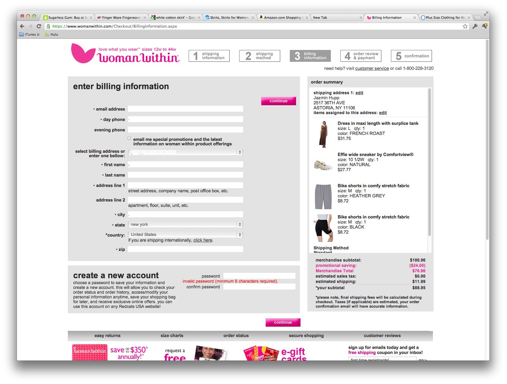
You Can't Handle Phone Extensions or ZIP+4

You tried to reduce the number of incorrect phone numbers you received by validating the number of digits but that also stopped customers with work phone extensions from putting them in. Not only are you causing the form to fail when the customer is trying to checkout but you're making it harder for your customer service staff. Now your staff is going to have to wade through menus or an operator to contact the customer directly.

WomenWithin had the worst ZIP code +4 handling. It returns a "your order cannot be processed due to technical errors" instead of a clear explanation of the zip code problem. I contacted their customer support about this issue and got blown off by an auto-responder apologizing for the problems I was having with their eCommerce checkout. (Too bad most of their customers give up their carts and they don't have methods to handle real technical feedback.)

Your Forms Don't Handle Auto-filling Correctly

Your customers are becoming more and more dependent on auto-fill features in the popular browsers and plugins. Test your checkout forms with:

  • Chrome, Safari, and Internet Explorer browser autofills on desktop and mobile

  • Popular plugins like 1Password, Lastpass, etc.

The Good

Discounted Upsell In Your Checkout

This can decrease your conversion rate when customers get distracted by a last minute upsell, however it may be worth the risk if basket size is more important. I prefer putting the upsell on the checkout confirmation page (after the order was placed) and offer free shipping on any added items.

Paying $200 a Month To Really Find Out How Your Customers Found You

Follow all the conversion funnels you want but you're still guessing precisely how your customers found you. Luna Bazaar gives away a $200 store credit once a month to customers who optionally answer two questions during checkout. The questions are:

  1. How did you find out about Luna Bazaar? (Be specific, for example "searched for paper fan in Google" or "Brides Magazine"

  2. What additional products would you like to see in our store?

Lower Credit Card Costs By Doing (a little) Good

Debit cards are typically several percentage points cheaper than credit cards to process. Hotels.com encourages customers to use debit cards by offering to donate $1 to Doctors Without Borders. They are saving more than they donate on most transactions while additionally appearing like they care. Saving Monday + Social Proof = Double Win.

Reorder Reminders

You should already be familiar with Amazon's Subscribe and Save feature, but if that doesn't fit for your store, check out what Uline does. Just a simple checkbox at the bottom of your checkout page, asking if you'd like a reorder reminder at some point in the future. This is a no brainer for supplies.

Adding Social Proof to Your Checkout

Ok you've got your Truste seals and BBB logo in your checkout already right? J&R goes one step further by displaying positive reviews right next to that checkout button.

Add Strong Method to Contact You On "No Result" Product Searches

On focused eCommerce sites, you should encourage shoppers to contact you for items you don't have results for. Arlington Wine turns any failed search into a partially filled out contact form for the search term. Large e-commerce and diverse sites may not be able to handle the volume of contact this generates but for a small store, this is excellent. By asking additional information about the item wanted, the message is more likely to be relevant to a product and they are more likely to be able to provide a price accurately.

Read More

Changing Behavior With Persuasive Technology

Design with the intent to change someone's behavior or attitude is a skill every startup and non-profit needs to master to get better results from their customers and communities.

830607791_556f8d7fc3.jpg

Plastic 52: Week 12I attended Behavior Change: As Value Proposition, given by Chris Risdon (@chrisrisdon, #behaviordesign) at SXSW Interactive in Austin.Changing behavior is hard:

  • Why do you drive short distances when you could easily walk and be healthier?
  • Why do you avoid going to the dentist when you know waiting longer will make your dental problems worse?

Using Opportune Moments

In 2004, you see a story about a Tsunami while waiting in the airport, which is followed by a commercial to donate to the Red Cross. You're moved to donate but then you have to take a flight, get home, unpack, and feed the dog. Maybe you remember to go to the Red Cross website but now you have to decide how much to donate, figure out your credit card billing information, and so on.In 2010, you saw the Haiti Tsunami story at the airport. You could text "Haiti" to 90999 and donate $10 via your cell phone bill to the Red Cross. This much simpler process matched the timing of the trigger and took advantage of your motivation in the moment.

Behavior Design

Design with the intent to change someone's behavior or attitude.

A bitter nail polish makes your finger nails taste bitter so you don't chew your nails. A study of countries by how many people volunteered for organ donation showed that countries had radically different rates because of the how they designed the sign-up process. Countries where you had to opt OUT of organ donation, had the majority of people registered for organ donation. Countries which made you opt IN to organ donation had the lowest rates. Just by changing the form process, you are able to design for your intended result, these are called "good defaults".

Persuasive Technology

Technology designed to persuade the user to use a system or platform in a desired way.

Amazon one-click is an example of a process designed to make purchasing easier. Instead of building a cart and comtemplating shipping charges, you're one click away from making a simple purchase. In the product space, software and services make it plain that you are trying to help the user organize their travel plans (TripIt) or finances (Mint). More and more of these sites use highly personal data to help you change your own behavior.

The New "Me" Generation

Products and services designed and marketed on the premise that their befits – the value received – are specific behavior-based outcomes.

  • Data collection is a primary feature: Nike FitBand collects data on your physical activity throughout the day.
  • System makes recommendation or guidance: Mint recommends credit card with less fees based on your purchasing data.
  • Behavior is measurable: Users can see their progress.
  • Prescriptive/Constrained self-determination: Service narrows options to guide user to their chosen outcome.

Sensors & Data

If it can be connected, it will be connected in the Internet of Things.

Sensors using GPS, Accelerometers, RFID, etc., measure everything from where we go to how fast we can bounce a basketball. Consumers are becoming less and less afraid of giving services access to personal data. Mint has convinced thousands of users to give them the login information for all their financial accounts.

Feedback and Feedforward

The progression from weighing at your weekly WeightWatchers meeting to a WiFi-connected scale that tracks you daily, illustrates how personal sensors can provide better timed feedback. Feedforward is proactive service design that gives you information before you make the decision instead of just showing you the results. Chris spoke about how at Subway sandwich shops he always intends to each a healthy sandwich but ends up buying the cookies at the end. What if a service detected he's entering the Subway and tells him how many calories he'd have to burn to get those cookies?

Framing & Profiling

Not everyone is motivated in the same way. Some folks need a cheerleader to "ra-ra" them up the hill, others need a drill sergeant to scare them into running harder. This is called "Persuasion Profiling," which means each one of us has a different set of triggers that will persuade us to act differently. Just in the wording of a choice, you can guide behavior.

Collection > Visualization > Story

We understand how to use the technology to show users their behavior but do we understand that every design decision influences the user? Documentaries demonstrate that HOW we tell a story changes people's perception, and eventually their behavior. Next stop let's go beyond the graph and show people how to change their word.

More Resources on Behavior Design


Read More

Providing Effective Long-Term Customer Support for WordPress Users

WordCamp-New-York-City-2012.gif

Supporting your community of users isn't the sexiest topic this week at WordPress Camp NYC, but providing great support can make or break your business. Mason James supports WordPress plugin users at WPMU Dev and runs WP Valet supporting individual WordPress sites. He manages supporting tens of thousands of users with a seven person support team.Support is the MOST Important Issue for Web Services!The code you've created is a commodity. It's the quality of your support that will keep your clients coming back (and paying you).Why Provide Support?

  • If you don't care about your users and your community, call someone who does to support your clients.
  • Long-term customers and community equals long-term revenue.
  • Publicly available forums and FAQs are extremely valuable content to convince search engines and new users to visit you (and then sign up).

Creating a Community

  • Welcome new members when they arrive. Send a welcome email. Send a friend request.
  • Show them ways they can get more involved. Send a group request right away.
  • Answer any questions in a timely fashion.
  • Ask for frequent, regular feedback from your community. (Polls, customers surveys, contact form, social media.)
  • Respond immediately and honestly when there is a problem. Be transparent and give a human apology.

Creating Better Support Materials

  • Use a variety of media types, some folks like videos while others like step-by-steps.
  • Nobody likes reading big blocks of text, break it up with screen shots.

The Best Tools for Great Community Support

  • Support Forum Tools: bbPress and BuddyPress are the best free WordPress support forums. ZenDesk and GetSatisfaction are great paid options with ticketing systems.
  • Buy common support topic content. For WordPress you can white label video tutorials from a company like wpmudev. They update all the videos with every WordPress upgrade so your content is always up to date. You can also link to Wordpress.com help content for easier to understand content than WordPress.org.
  • Use a WordPress update management tool like Manage WP to update plugins/themes across multiple installs from one great dashboard. WP Remote is another free option that's newer.
  • Create reward mechanisms for users helping each other. BuddyPress allows users to reward points to each other for writing helpful content. This will save you tons in support costs.
  • Make sure users can rate your support documents and support responses so you know where you need to improve your content.
Read More

Increasing Page Views & User Retention on Your Wordpress Blog in 3 Minutes

related-content.png

Do your readers leave your site right after they finish the first post they came in on? Neil Mody from nRelate gave a great overview of all the elements you need to use to drive more readers to your site and get them to stick around for longer at WordPress Camp NYC today. If you know the basics already, skip to the end for all the plugins your should install in 3 minutes to increase page views.You've Got Nothing Without Great ContentFocus on your message first. Create an original consistent presence on the Internet with quality content first. Then you can build a long-term audience. Everything else optimizes on high quality content. Without good content you won't get far. Your Site Must Load in 3 Seconds or LessYou must use a caching plug-in to speed up the load time of your pages.

Then you need to use speed loading testing tools to check it.

Hosting Options (from least to most expensive / least to most scalable)

Everything you add to your site will make the site slower. Your site should load in 3 seconds or less. For every extra second your site takes to load you lose a portion of visitors according to Google's analytics.Bring Style to Your Substance With a Quality ThemeHow your site looks can be just as important as your content. Having a stylish theme with clear navigation affects how many users stick around to read more. Just as how a book's cover design affects how many people buy the book in the book store, your theme will affect how many users will read your site.Social Sharing in NOT OptionalYou need to:

  • Link to your site on Twitter
  • Have an active Facebook page
  • Start using Pinterest

You MUST reach out to people in your community and engage! Start commenting on other people's posts. Sending out your content is just half the job, engaging others is your other.Be Where Your Audience Is

  • Depending on where your audience is, you need to rank well there. In the US, search traffic is dominated by Google so you must rank well in Google.
  • Study your referral traffic and see what terms readers are coming in from. Build content around your most profitable terms.
  • Setup Google news alerts for related terms to your content. Build content around trending topics.
  • Link parties are collectives of bloggers who are linking to each other to building incoming links. You have to be careful though because your links could end up on less desirable sites.

FINALLY! Engage Your Audience Beyond the One Post They Came in OnnRelate makes plugins for most of these functions but there are tons of great options out there. Tell us which plugins you like in the comments.

  • Auto-linking plugins automatically ads a link back to your other content whenever you add certain words to your post.
  • Photo galleries and slideshows increase page views (but can be really annoying).
  • Related Post plugin should be in your sidebar or at the bottom of your post.
  • Most popular post plugin should always be in your sidebar.
  • Flyout plugins suggests a related article to your reader when they reach the bottom of the post
  • Social sharing and commenting plugins allow your users to easily share your content to their network. One developer said you have to un-gate (not require login) to encourage commenting.
Read More
Web & Mobile Techn... Jazmin Hupp Web & Mobile Techn... Jazmin Hupp

Data-Driven Search Engine Optimization

GoogleCandles.jpg

I attended Data-Driven SEO taught by Hamlet Batista at General Assembly. Hamlet's first claim to fame was gaming the search engines to rank on the first page for "Viagra" and make seven figures in commissions in 2002-2005. More recently he is the technical editor for The Art of SEO

Pretty Code Don't Matter

Code that validates perfectly sounds like a great idea but if you run code validation tests on the most popular websites you'll see errors all over the place. Search engines don't care if your code is perfect, they care an audience wants it.

The Basics

All these steps must be done in order.

  1. Crawling - Google must find the site

  2. Indexation - Google must index the site

  3. How The Results Are Presented

  4. What You Do With The Traffic

You Can't Control Rankings, Control Your Traffic

Rankings depend on many factors, many of which are outside your control, instead:

  • Increase the number of pages that are driving search traffic to your website or

  • Keep the same number of pages but increase how much traffic each page drives

Easy & Fast: Improve How Google Shows Your Search Listing

  • Use Google Adwords to figure out what the best marketing message is for your audience

  • Change target landing pages to match those marketing message

  • Test the updated pages against your previous click-through-rate, roll-back any negative changes

  • Write descriptive titles and meta description, make them read like ads, and incorporate keywords intelligently

Rankings

You can cheat the rankings temporarily with black hat tactics but they only work for so long. Instead focus on keyword battles you can win. Target keywords that will drive the right users instead of generic keywords or overly generic keywords.

Indexation

The more pages your site has, and the more pages you get indexed, the more traffic you'll receive. You can get an estimate of how many pages Google is indexing by searching for "site:yoursitename.com" in Google. The more reliable method is to submit an XML site map to Google. To improve your indexing...

  • Consolidate duplicate content: search engines will try to ignore it

  • Address canonicalization issues: make sure to permanently redirect your traffic to either www or not (doesn't match which, just be consistent)

  • Make sure each page has unique and useful content

  • Interlink intelligently by finding pages that don't have many links to them and create a blog entry that references them (since your blog gets more links to it, it can spread the link love to less-indexed pages)

Crawling

  • To see if a page has been crawled, type into Google "cache:www.yourpageURL" to measure when the individual page is crawled. If the site hasn't been crawled for a long time, it may be that Google is penalizing you.

  • Analyze your traffic logs to see how often the search bots are hitting each page and any errors they are hitting

  • Make sure to create a comprehensive XML site map with all your UNIQUE content

  • Use text based site navigation to assist the crawlers

  • Try to avoid dynamic URLs (avoid javascript-based site navigation)

  • Avoid pages with only images and flash content, if you have a video include a text transcript of the video

Link Acquisition

  • Build relationships with press and bloggers

  • Create and promote enticing content

  • Contact everyone on your mailing list to add you to their site

  • Adopt viral content ideas from sites like BuzzFeed to your niche

Photo by Jerry Paffendor

Read More
Productivity, Web & Mobile Techn... Jazmin Hupp Productivity, Web & Mobile Techn... Jazmin Hupp

Using Google Spreadsheets for Data Visualization Charts

GA_-Data-Visualization-Workshop.jpg

To learn how to build interactive data visualizations with no code, using completely free tools, I attended Ben Jackson's class at General Assembly.

Importing HTML into Google Spreadsheets (This tip was worth the cost of the class!)

  • In a cell type =ImportHTML("http://www.anyurl.com", "table", "#")The number is which table is it on the page. So if it's the 6th table on the page, enter 6.

  • This data will live update with the page, that's awesome except if they take down the page. So it's best to copy it and use Paste Values into a new sheet if you'd like to continue using the data.

Creating Pivot Tables

Pivot tables allow you to view data sets with multiple attributes in different ways. It's a great tool when you're trying to figure out if disparate data correlates in a meaningful way. Just remember correlation doesn't equal causation.

  1. Select all the data you want to analyze (including the top column names).

  2. Select Data > Pivot Table Report.

  3. First add one or more rows.

  4. Then add one or more values.

  5. To split how the values are displayed you can by adding columns.

Inserting Charts

  1. Select the data you want to display.

  2. Click the Insert Chart button on the tool bar.

  3. Google will default to chart suggestion, this is a live preview that you can play with.

  4. If you chose a chart type that the data doesn't support, Google will tell you why is doesn't work.

Creating Maps

Another option for creating Maps is MapBox.

  1. Your data must have the full state names or country names (no abbreviations) and you have to spell them right.

  2. Click Insert Chart button on the tool bar.

  3. Navigate to the Map chart. You'll then have to customize the chart to just the portion of the world you're examining.

  4. You may want to change the colors of the Min and Max to create a heat map.

GA_-Data-Visualization-Workshop.jpg

GA_ Data Visualization Workshop

Getting Your Charts Out of Google Spreadsheets

  • Click the pop-up menu on the chart and select Save Image.

  • You can also copy it to your web clipboard and paste it into other Google documents.

  • Click the pop-up menu on the chart and select Publish. You can copy the script into your site. If you update the Google doc, it should also update the chart.

Google Spreadsheet Tips

  • Break things up into chunks: Keep less than 500 rows in each spreadsheet. Google slows down as you go over around 500 rows.

  • If you need to reduce the file size to free up some memory. You can delete any of the columns not being used by your data.

  • Try using Import to replace or add a sheet of data.

Read More

Data-focused App Development for the iPad Best Practices: A Kaplan Case Study

photo-3.jpg

How can textbooks on the iPad revolutionize learning? Kaplan provides study guides and tutoring for standardized tests such as the SAT, LSAT, and GRE. Kaplan set out to digitize their study guides and found out that data on how your students read can revolutionize your product development. Maureen McMahon and Jeff Olson from Kaplan presented a case study in mobile content delivery and data-focused product development at O'Reilly's Tools of Change Publishing Conference in New York City.Start With Studying Your UsersBefore digitizing their first book, the first step Kaplan took was to study their existing customers. They knew they were the leading publisher in the space but had to study if their customers wanted digital books. They surveyed their students on which tablet they owned or were planning to purchase. They also started an ethnographic study of how students were using Kaplan's paper books. In talking to students about their studying habits and taking photos of how students highlighted the print, they discovered what students did with their books. Why Students Liked Paper Books

  • Need for tangibility & token of ownership: If it is physically in my life, I'm more likely to study.
  • Make markings/highlights to sustain attention: Some students highlighted almost the entire book.
  • Make markings as proof to self of completion: Even if they didn't read it throughly, they liked to mark the sections they had read through.
  • Keep markings as future study aid: Occasionally students would reference sections they've highlighted but much less often then Kaplan thought.
  • Make visual memory of content on page: Some students with a visual memory needed the colored highlight to remember materials ("that section was in blue").

"Everything You Can Do On Paper And More"Kaplan decided that their goal was to take everything students could do with the print edition and surpass it on mobile devices. This included:

  • Multi-colored highlighting
  • Take Quizzes With Instant Feedback on Answers
  • Add Written Notes
  • Record Audio Notes
  • Sophisticated Search
  • Video of Professors Teaching Sections

Kaplan's First iPhone App ReleaseKaplan outsourced book conversion and licensed a reader from Bluefire, which was compatible with Adobe software. They learned that their books were incredibly complex to convert and are bringing that process in house. They used technology from MarkLogic for distribution and data collection.The reaction to the original iPod touch/iPhone App (released before the iPad came out) was not overwhelmingly positive. By asking their users for feedback, they learned a lot about the strengths and weaknesses of their assumptions. They decided to scale back their goals to the competitive advantage of eBooks, which was books are heavy. Their MCAT book set weighs 10.5 pounds whereas the iPad weighs only 1.3 pounds.Study Your Users Even MoreKaplan moved to an agile development method. They gave away the digital book with the print edition so they could collect a lot of usage data and quickly iterate development. As of today, Kaplan is iPad only and hasn't gone back to the iPhone App format since their first release.According to Kaplan's survey, 70% of the students had not used electronic textbooks in their high school and college coursework. Of the ones who had used digital textbooks, only 15% of early adopters had an excellent experience. More students have taken an online course (46%) than used electronic textbooks. When you ask students if they want analog or digital study aids, about half say they want some digital and some paper materials.Data Drives Better Learning OutcomesTraditional print books aren't able to "phone home" and tell you how their being used. Kaplan is now able to quantify and analyze how often students do the following actions:Informative Metrics from eBooks

  • Opening book
  • Going to table of contents
  • Navigating to a chapter
  • Annotations (highlights) made
  • Flipping pages to find something you're looking for
  • Turning the page/how fast pages are read
  • Which pages are referenced most
  • Going to the glossary to see the definition of a word

In the same way that other businesses have used data analysis to improve business outcomes, Kaplan is using their studying statistics to improve their content and change learning outcomes. They are able to ponder the learning implications of informative metrics for eBooks (click graphic for larger view of slide).Are we heading to a future where professors can actually tell that you do the reading? Will they be able to tell you did it quickly in the fifteen minutes before class? Kaplan plans to share student reading data with their instructors. Instructors will be able to see which sections their students are spending more time on and perhaps need additional converge in the classroom.If you are in the business of developing products and you have this information, "it'll change your life." They had to reorganize into agile development teams to respond to the data. "There is no point in collecting this data" if you're not ready to implement changes around it.Challenges for Digital Learning Development

  • Data vs. intuition: What are the things data won't tell us? What can't you measure.
  • Managing the fire hours of data: What are the metrics that really matter? Otherwise you will overwhelm your team with data that doesn't help them develop better products.
  • How will this change the reading experience?
Read More

New Trend: Video Holiday Cards - Bergdorf Goodman Goes to the Dogs

Bergdorf-Goodman.jpg

I received more video holiday cards than physical cards from businesses this year for the first time. Whether your business is trying to save trees or just preparing for the Postal Service to go out of business, a video holiday card might be right for you.

Tips For Spreading Your Business Message with a Video Card

  • Set a budget: Although a video card is cheap to send out through email, you can spend much more producing a video than printing paper cards. Make sure to set a budget and find a video director that can work within it.
  • What's the payoff?: The best holiday videos have a plot payoff for watching them. You know how the best commercials can make you want to cry in 30 seconds? Can you make your story pay off at the end? Watch Bergdorf Goodman's longer holiday video for their heartfelt ending. Or check out LivePerson's charity donation at the bottom of this entry.
  • Keep it short: 30 seconds to 2 minutes is optimal
  • Keep it agnostic: Unless you're sure all your customers celebrate Christmas, it's better to go for general Happy Holidays.
  • Make it fun(ny) or unusual: If you want the video to be shared, make it fun or funny. On the unusual side, Tekserve's most successful viral video featured $60,00 worth of recycled iPods.
  • The delivery method is the most important part (and often overlooked): Once you have the perfect holiday video card, the most important part is getting it watched. Make sure you consider the timing of sending your video to recipients, the holidays get busy and any non-essential message gets trashed. Can you create a great email message that will make them want to click-through? Will your recipients be able to view it from their mobile phones?
  • Seed the sharing: If your holiday message is meant to reach potential customers as well as existing customers, reach out to target blogs and ask them to embed the video. Don't forget to upload it to your Facebook page and YouTube.

Bergdorf Goodman's Holiday Card

Bergdorf Goodman, a luxury department store in Manhattan, created a great holiday promotional video card by letting famous New York dogs lose in the store. Not only are cute pet videos more likely to be shared, but also I would argue that BG's target customers are dog owners. Because having a dog in Manhattan is a luxury, their shoppers are more likely to be pet owners. The fun footage of dogs running through the store gave them a great excuse to show off a lot more products than a typical commercial. Although I would have made the video shorter, the ending is the perfect heartfelt payoff that their target customers will love. If you check the audience analytics on YouTube, you'll see this video is most popular with women age 35-54 (their target customers).

Offering to Donate To Charity

With more businesses limiting gifts to employees, donating to charity on their behalf has become popular. LivePerson sent their customers an email asking them to visit the page screen-shot below and choose from one of twelve charities for a donation. This method aligns your organization with doing good while making your customers feel good. You'll notice LivePerson doesn't mention how much they will be donating so the bottom-line impact was totally up to them.

Read More

12 Things You Haven't Tried To Improve Your Website's SEO

GoogleSearch.jpeg

"Best practices are things you should have done if you had thought of them first." If all your competitors are doing it already, you won't get the returns you're looking for by jumping in late. Try taking best practices from other industries and reusing them. This quote is from Byrne Hobart, who taught the Advanced SEO course at General Assembly that I attended last week.How to Advance Your Way Up the Blog HierarchyHere's how to work your way from nothing to a top-level blog or news source.

  • Do a Google search for "your industry blog" and you'll find the most popular ones. Pick a highly-ranked blog that speaks to your prospects. Then use Google to show sites related to the highly-ranked blog by searching for "related:rankedblog.com." Less popular related blogs will be returned. Continue to do this until you find the least popular blogs with readership communities. Collect these into a list.
  • Stalk your new blogger friends. Comment on every post they write on your industry and re-tweet their stuff. After a few weeks they'll start to recognize you as a loyal reader.
  • Write a post they'll like on your blog and send it to them. For example, write a deeper-dive into a topic they cover or a clarification of something they wrote. If they repost your piece you're in! Plus you'll be the girl they turn to when they need a quote or clarification on your industry.
  • Now use their repost of your content to trade up to more popular blogs. Most bloggers read all the blogs larger than theirs and a few sites less popular than theirs. Write an email to a more popular blog, "You may have seen my post on LesserBlog.com, I liked your related post, and so I write this post."
  • Continue trading up until you reach the top blog in your industry.

Get More Shares By Giving Up CommentsYou can get more shares if you make sharing the only action available at the end of your post. When someone gets to the bottom of your post, they typically have a couple of choices: commenting, reading a related article, etc. If you make the only option sharing the article with their network, you'll get more shares. This works especially well with controversial content where your audience wants to add their input but can't because you've removed commenting. Google doesn't discern between people linking to your page because they disagree or agree with you.Fast Content Gets Shared FasterContent that is fast to read will get shared more often and more quickly. Shorter posts rise to the top of Reddit because Reddit takes the velocity of votes into account. So a photo that takes five seconds to read and react to will rise further than a well thought-out post that takes ten minutes to read. So if you have a long article, create an infographic of your top data from the post that you can share everywhere and then link back to your longer article.Get More Shares By Figuring Out Why Your Audience Really ReTweetsWhy do most people actually share your posts? They want to show off that they read your type of content (regardless of whether or not they do). This is why posts by Malcolm Gladwell are tweeted seconds after they're posted. Your audience wants to show off how smart they are for finding your content and sharing it with their friends (Facebook) or potential bosses (LinkedIn).Test Keywords Using AdWords Instead of SEO Because It's Cheaper (Really)Ranking on your keywords through organic search can take weeks and even months to climb to the top. You can buy the top slot through AdWords and check if the keywords you've chosen really convert before investing in a longer-term SEO strategy. Once your keyword terms move into organic search the conversion rate won't necessarily be the same but this is a great tactic to compare potential keywords against each other.Swap SEO Friendly Headlines In After Everything-Else Friendly HeadlinesSEO friendly headlines are stuffed with keywords that target searchers. Everything-else friendly headlines use a teaser proposition, controversial view point, or question to encourage click-throughs and shares. You can post the article with your teaser headline, get a lot of shares, and then switch it to your keyword stuffed headline later. Your article will retain it's popularity for being shared even after you change the headline.How A Print Ad Can Increase Your Search RankRun an ad campaign that tells your audience to search for "your company + what you do" on Google. If you get enough people searching for your brand name in conjunction with high-priority keywords, it will rise your search rankings. You'll be more likely to appear in the search suggestions for what you do. Coupon Cabin ran subway ads asking people to Google their name for coupons instead of listing their URL.Optimize Your Guest Blog BioWe all know that guest blogging (in both directions) will help bring credibility to your site. What you may not have thought of is optimizing the keywords used in your guest blog bio. Try to keyword stuff the link back to your company's site. So instead of "Jane Smith is Founder of Company.com" try "Jane Smith is Founder of the most popular widget company in New Jersey."Links Are ForeverWhen someone posts about your business but doesn't link to you, simply contact them and ask. Articles last just as long as the news cycle but links are forever.Use WordPress if You CanSimply put, search engines love WordPress. To solve the SEO drawbacks of WordPress, download the All in One SEO Pack.Use The Most SEO-Friendly URL For Your BlogYour blog's URL should be YourSite.com/Blog for maximum SEO benefit to your site. If you're in a "serious" business and the term "blog" isn't appropriate for your target audience, use YouSite.com/Articles or YouSite.com/Research.This post also appeared on Women 2.0's Blog For Female Entrepreneurs.

Read More

6 Trends in Web Design Coming To A Website Near You

Web design shifts and changes every season just like the fashion world. Instead of watching a runway on Fashion Week, here's a few sites I use to preview what's likely to take off next:

  • Behance Network - Creative Professional Platform to share what designers are working on now. Filter results by Blogging, Web Design, or Web Development for a peak. Behance is a NYC-based startup.
  • Dribble - A nicely designed portfolio site, check out what's been posted in web design lately. Allows you to search by color if you have one in mind.
  • DeviantArt - Less curated than Behance but still relevant, click my link for an overview of popular web interfaces submitted in the last week.

Huge F'ing Background ImagesPopularized into the mainstream by Bing, this has spread to tons of tech startups and newer page designs. Go Right Not DownWhen web designers found out that folks didn't want to scroll down for more than a few page views, they started asking viewers to navigate to the right.Arranging Images In Tag Cloud StyleJust like a word tag cloud makes more frequent words appear larger, some sites are now organizing their images using this principle to make more important images larger. Notification AlertsUsing smart icons with red badges has become prevalent from iPhone Apps to Facebook.


Grey GradientsBlack is too hard to read and white is so 1996, so we've settled on grey gradients as the cool kids color.Better TypographyWe finally got bored with half a dozen font choices and the following companies are driving better typography coming to the world wide web.

Read More