Where To Start Optimization Testing On Your Website

If you're just getting started with web optimization testing or have limited testing resources (hey that's like everybody), which pages you test is the most critical decision you have to make.

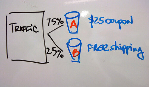
2164167813_d064804fee.jpg

If you're just getting started with web optimization testing or have limited testing resources (hey that's like everybody), which pages you test is the most critical decision you have to make. At today's WhichTestWon's Conference I learned from Justin Rondeau that our optimization instincts are probably wrong on where to start testing.

Page Requirements for Optimization Testing

Before you can test a page, it must meet these two requirements:

  • Does the page get enough traffic to reach statistical significance in a reasonable time frame (1-5 weeks)?

  • Does the Page Directly Impact Conversation? If Yes, what is the current conversion rate? If No, what is the long term value of the conversion that this page lifts?

Start Lower in Your Funnel

For an eCommerce site, start as late in your conversion funnel as possible. Here's a typical eCommerce funnel:

  • Entry Pages: These are politically charged since many people may be involved in creating these campaigns, skip optimizing these first.

  • Category Pages

  • Search Results

  • Product Pages

  • Cart & Checkout: START HERE. Few people will challenge you to improve the cart because carts are just carts. You can create a lot of lift here.

  • Receipt/Thank You: Rarely tested! Try an up-sell or cross-sell here instead of during checkout.

Next, Where Is Your Landing Money?

Don't start with high bounce rate pages. We know–they're sinking ships that you'd like to save. Not worth your time. Try landing pages for your highest conversion traffic. Or landing pages for your most expensive (PPC) traffic.

Next, Test Your Conversion Path

Now that you've improved the beginning and end of the funnel, now you can test the middle. This means testing your category pages, search result pages, product pages, and so on. Find everything that is stopping people from buying in your funnel and test how to fix it.

Next, PPC Traffic

If you're paying for customers to click on your links, you need to nail the landing page. At a minimum, your page needs to feature what your ad claimed. You'll be surprised at how many people screw this up.

Next, Referral Traffic

Know who is sending you traffic and where they are sending them. Make sure you're meeting the standards that people expect.

Am I Done Yet?

Of course not! Follow WhichTestWon for more testing ideas or get you butt to Austin for the Live Event. 

Read More

2014's Hot Homepage Design Trend: Mega Images

You know those giant brand images filling up new home pages? Looks great but does it work?
GrassRootsMegaImage3.png

Justin Rondeau examines tests from over a thousand brands every year, as Chief Editing & Testing Evangelist for WhichTestWon. Justin explained the Mega Image trend he's seeing across the industry and some tips on doing better testing at WhichTestWon's Live Event in Austin today.

Do Mega Image Homepages Work?

You know those giant brand images filling up new home pages? Looks great but does it work? Justin presented a case study from KinderCare, which had been fine tuning their home page for years but was looking for a big lift. After the redesign with a Mega Image, they experienced a 17% lift in conversion. That's a huge lift for an established homepage but the resources required to pull this off are also huge. Unlike changing the color of a button, you've got to coordinate fresh creative that blows your brand out of the water.

Mega Image Tips

  • Make sure your photo scales with the browser window size.
  • DON'T use stock photos: make it genuine, make it your brand! At one company we spend about $30K a year shooting photography of our employees and our customers. (If you're looking for a team to do the same for your business, I use Meier Brand's creative team.)
  • If you're using faces, try to make sure the person in your photo is looking where you want the visitor to look. Faces grab a lot of attention and will be the first place your visitors look. If they compete with your main message you probably won't see a lift.
  • Don't implement blindly, make sure to test this. Although there are lots of instances of this working for other brands, your experience may be different.

KinderCare Home Page

Mega Image Homepage Designs With Movement

I don't have testing data on these, but was intrigued but two Mega Image homepages that use movement to complement the design. Click through the images so see one very common and one not-so-common movement implementations.Grass Roots Mega Image HomepageBoundary Breaks Winery Mega Image Homepage Redesign

How To Start Testing

Many marketers say they don't have the resources to start testing but tools like Optimizely make testing easier than ever. Here's a few tips on getting started.

  • Education is #1: The tools are great, but it doesn't replace a sound education in testing fundamentals. I personally recommend WhichTestWon's Live Events to start. You can also download their report on testing trends.
  • Hire a Proper Team: Optimization requires people. If you have no one, push for a part-time resources. If you have part-time resources, push for full-time, and so on.
  • Push for an Ideological Shift: If your organization doesn't believe in a data-driven testing, you're going to have to push for that from the top down. That means constantly communicating how your testing, the learnings and your results (good and bad). Showing the improvements you're making constantly will build trust in testing.
  • Stay Curious - Question Everything: If there is one thing to look for in your testing culture, it's insane curiosity. Do you question everything? Great! You're doing to go well here.

Stop Sporadic Testing

Many organizations are testing as they like without a methodology.

Why It Doesn't Work

  • No Long Term Gains: You may be small lifts but you won't be able to scale that effect.
  • No Test Learnings: Just because changing a button color created a conversion lift, doesn't mean you know why. If you can't figure out why, you can't apply that learning going forward.
  • Higher % Failure Rate: Your tests are much less likely to be correctly formulated if you don't do this very often.

Why We Don't Test More

The majority of organizations only have one person dedicating half their time to testing. It's your job as an optimizer to build the case for more testing resources with a proven track record of successful lifts. If you're not reporting back on your successes and continually proving your contribution on the bottom line, start now!Testing Staff Members

Read More

Increasing Page Views & User Retention on Your Wordpress Blog in 3 Minutes

related-content.png

Do your readers leave your site right after they finish the first post they came in on? Neil Mody from nRelate gave a great overview of all the elements you need to use to drive more readers to your site and get them to stick around for longer at WordPress Camp NYC today. If you know the basics already, skip to the end for all the plugins your should install in 3 minutes to increase page views.You've Got Nothing Without Great ContentFocus on your message first. Create an original consistent presence on the Internet with quality content first. Then you can build a long-term audience. Everything else optimizes on high quality content. Without good content you won't get far. Your Site Must Load in 3 Seconds or LessYou must use a caching plug-in to speed up the load time of your pages.

Then you need to use speed loading testing tools to check it.

Hosting Options (from least to most expensive / least to most scalable)

Everything you add to your site will make the site slower. Your site should load in 3 seconds or less. For every extra second your site takes to load you lose a portion of visitors according to Google's analytics.Bring Style to Your Substance With a Quality ThemeHow your site looks can be just as important as your content. Having a stylish theme with clear navigation affects how many users stick around to read more. Just as how a book's cover design affects how many people buy the book in the book store, your theme will affect how many users will read your site.Social Sharing in NOT OptionalYou need to:

  • Link to your site on Twitter
  • Have an active Facebook page
  • Start using Pinterest

You MUST reach out to people in your community and engage! Start commenting on other people's posts. Sending out your content is just half the job, engaging others is your other.Be Where Your Audience Is

  • Depending on where your audience is, you need to rank well there. In the US, search traffic is dominated by Google so you must rank well in Google.
  • Study your referral traffic and see what terms readers are coming in from. Build content around your most profitable terms.
  • Setup Google news alerts for related terms to your content. Build content around trending topics.
  • Link parties are collectives of bloggers who are linking to each other to building incoming links. You have to be careful though because your links could end up on less desirable sites.

FINALLY! Engage Your Audience Beyond the One Post They Came in OnnRelate makes plugins for most of these functions but there are tons of great options out there. Tell us which plugins you like in the comments.

  • Auto-linking plugins automatically ads a link back to your other content whenever you add certain words to your post.
  • Photo galleries and slideshows increase page views (but can be really annoying).
  • Related Post plugin should be in your sidebar or at the bottom of your post.
  • Most popular post plugin should always be in your sidebar.
  • Flyout plugins suggests a related article to your reader when they reach the bottom of the post
  • Social sharing and commenting plugins allow your users to easily share your content to their network. One developer said you have to un-gate (not require login) to encourage commenting.
Read More